Our user research team agreed to aid us on finding user group for our design excercise, based on the data provided by our research team at the end of the research we found that the users for our Frisp website were aged between 25-44. Potentially parents of children and fitness enthusiasts.
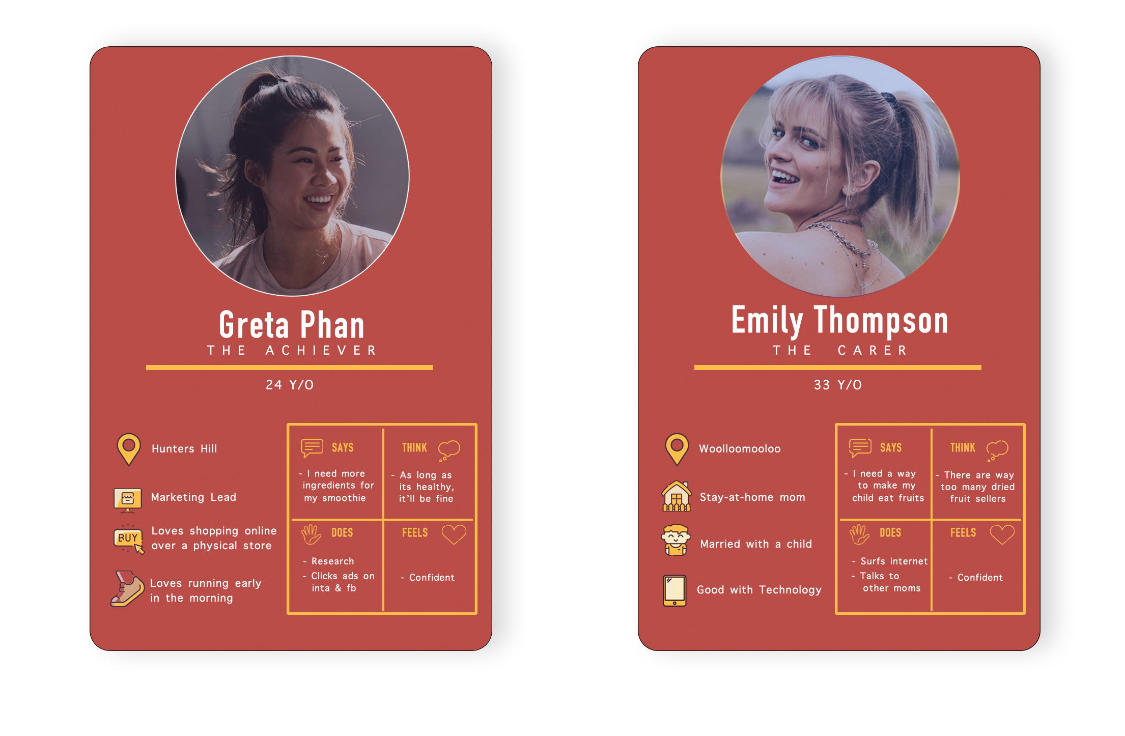
Persona Representing the user groups
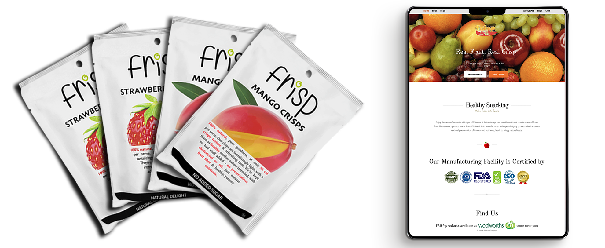
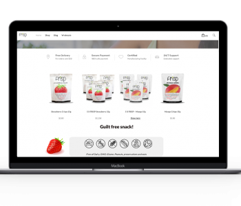
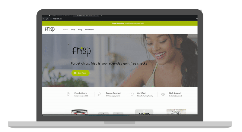
The design of an existing Frisp website (Right) didn’t comprehend the packaging (Left)
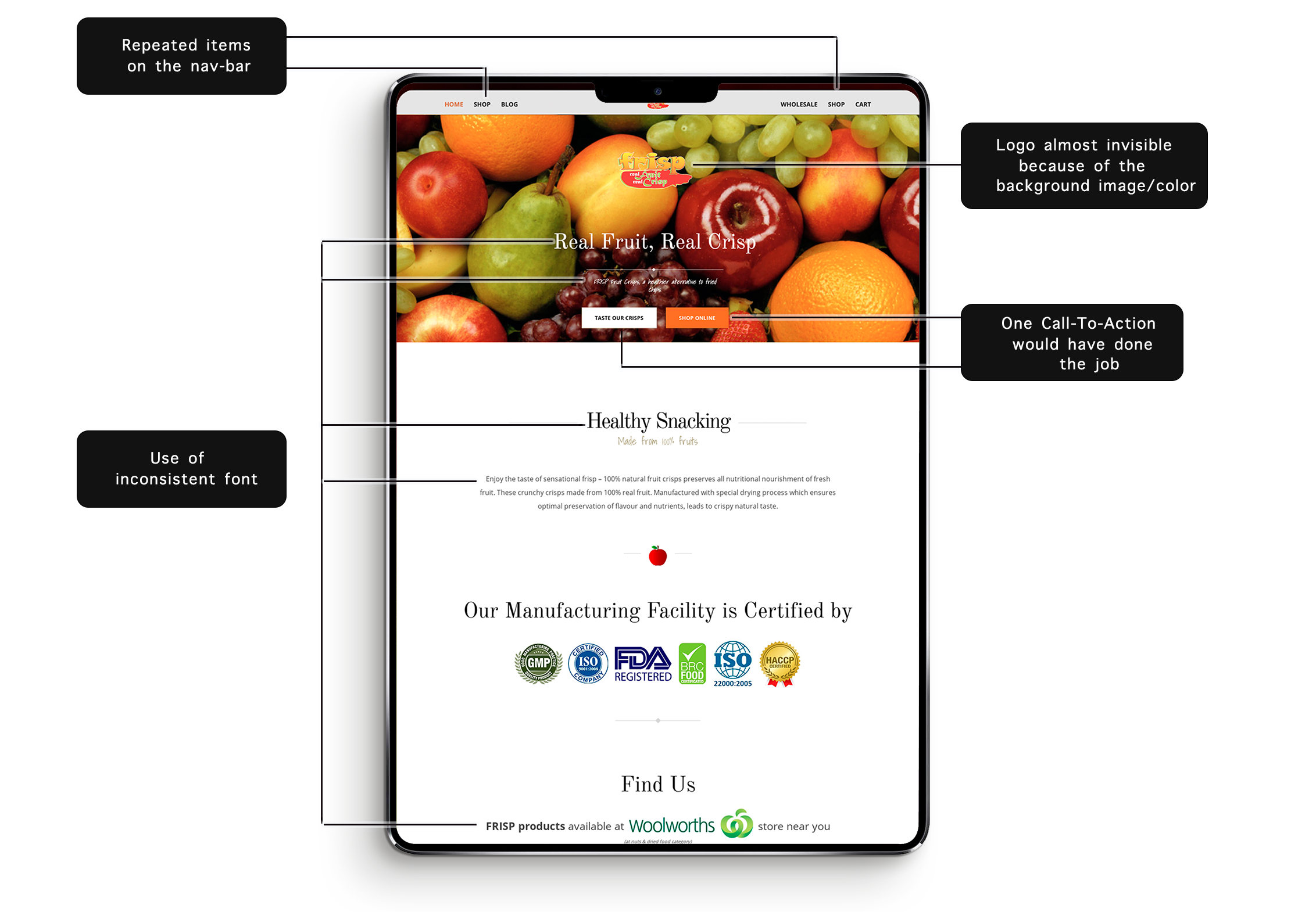
Design flaws/recommendation in existing frisp website [ navbar, hero, and content section ]
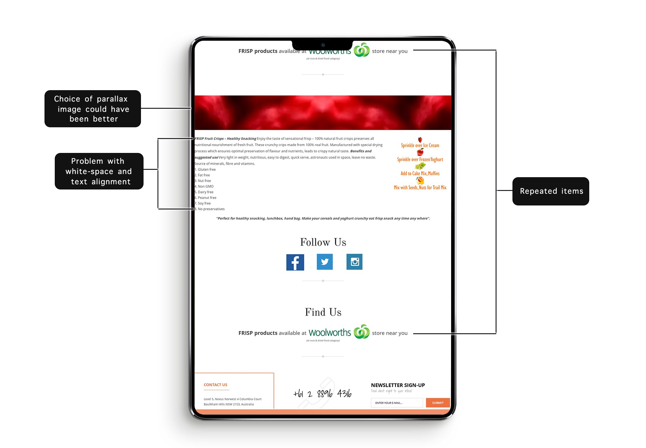
Design flaws/recommendation in existing frisp website [ content section and Footer ]
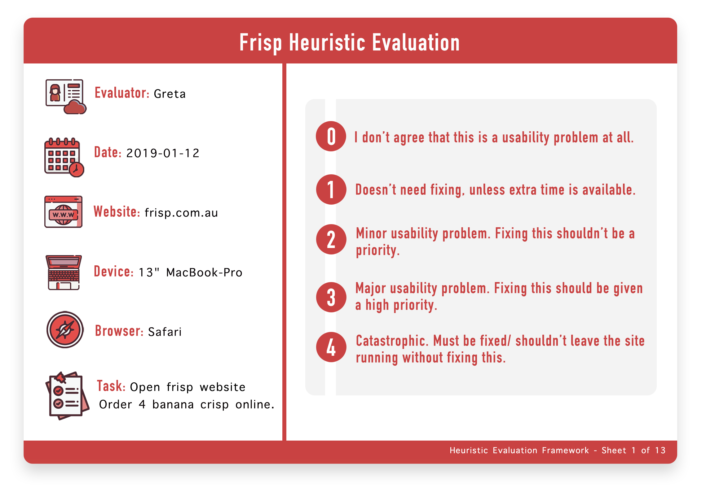 Heuristic Evaluation sheet 1 with grading criteria and basic details
The picture above is the first sheet of heuristic evaluation out of 13 sheets which displays the details of user testing that was conducted with the evaluator. We wont be including every single sheet in this project since the whole portfolio project will have insane amount of images. We will instead include relevant pages out of the evaluation.
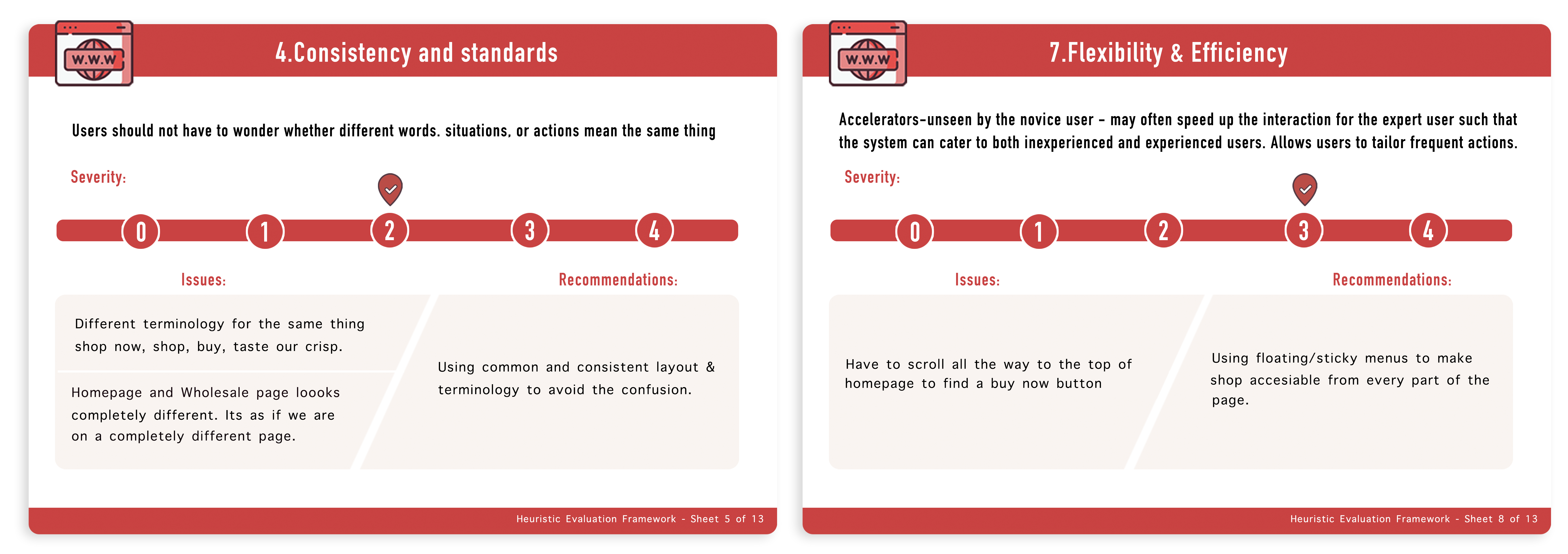
Heuristic Evaluation sheet 5 and 13 with issues criteria and basic details
Based on all the data we collected we tried reframing the problem, so that every time we are about to make any decision, we would think of this question in our head and see is it contributing to what we are trying to achieve.
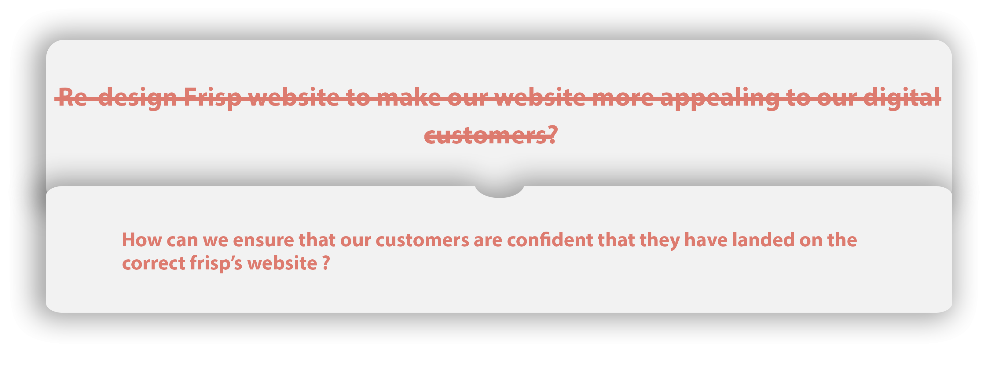
Reframed Problem Statements
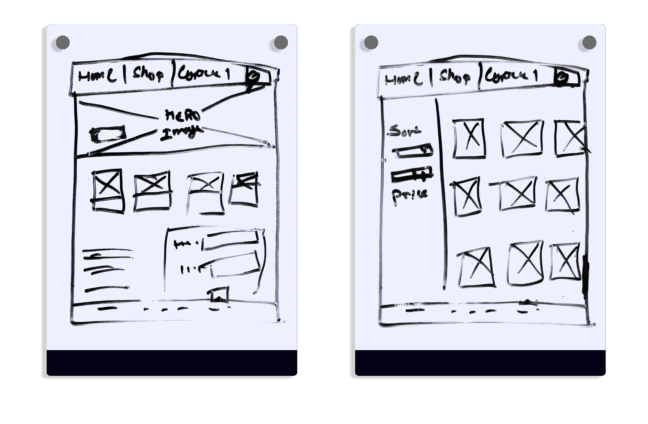
We started with some Lo-Fi prototyping simply by using a texter and our drawing board. We came up with at least 6-sets of wireframes and decided to proceed with the ones below. The whole concept of these prototypes were to make sure, that we get the initial ideas or basic picture of what the site is going to look like. we haven't used any colours and have left the components and other detailed ideas of website so that we don't get attached to any designs that has been done. We were sure that these wireframes from the initial prototyping phases were going to be changed in an immense amount once we start building the visual design.
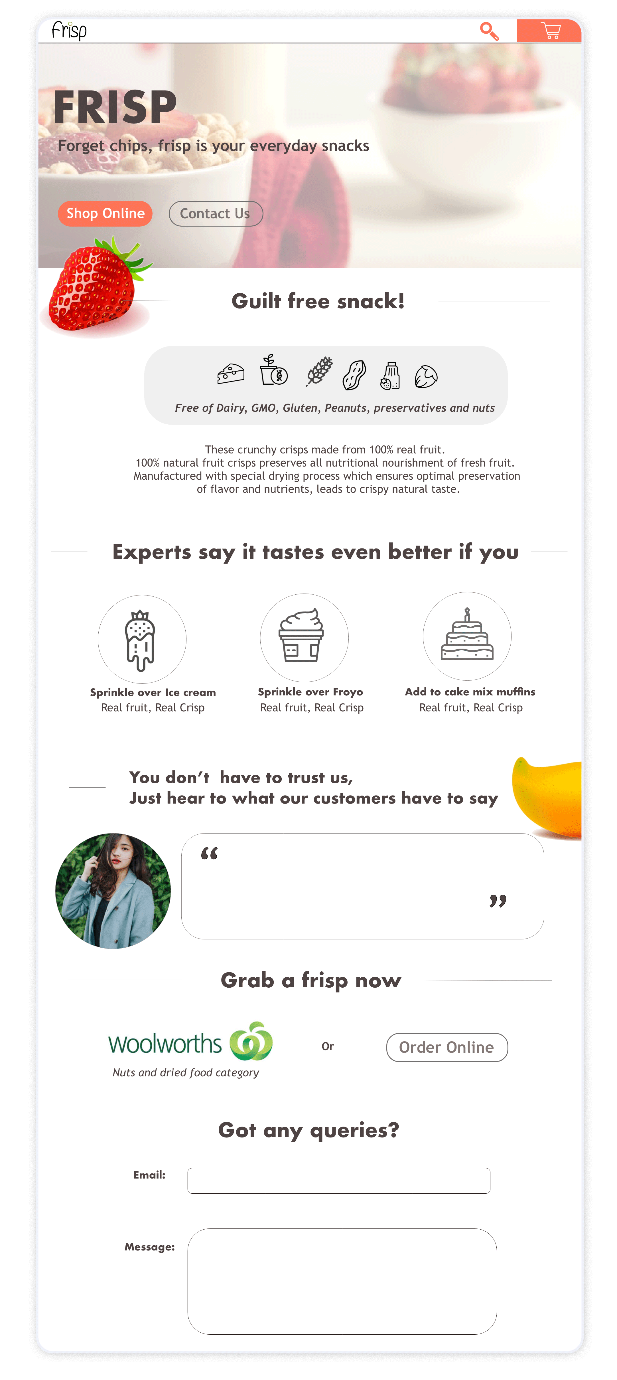
The lo-fi wireframes were enhanced into Mid-Fi prototypes to get an approval from the board, which was to be further designed into a Hi-Fidelity prototype. We started working on our first version of our frisp_high fidelity prototype. The picture below is our first version of the prototype.
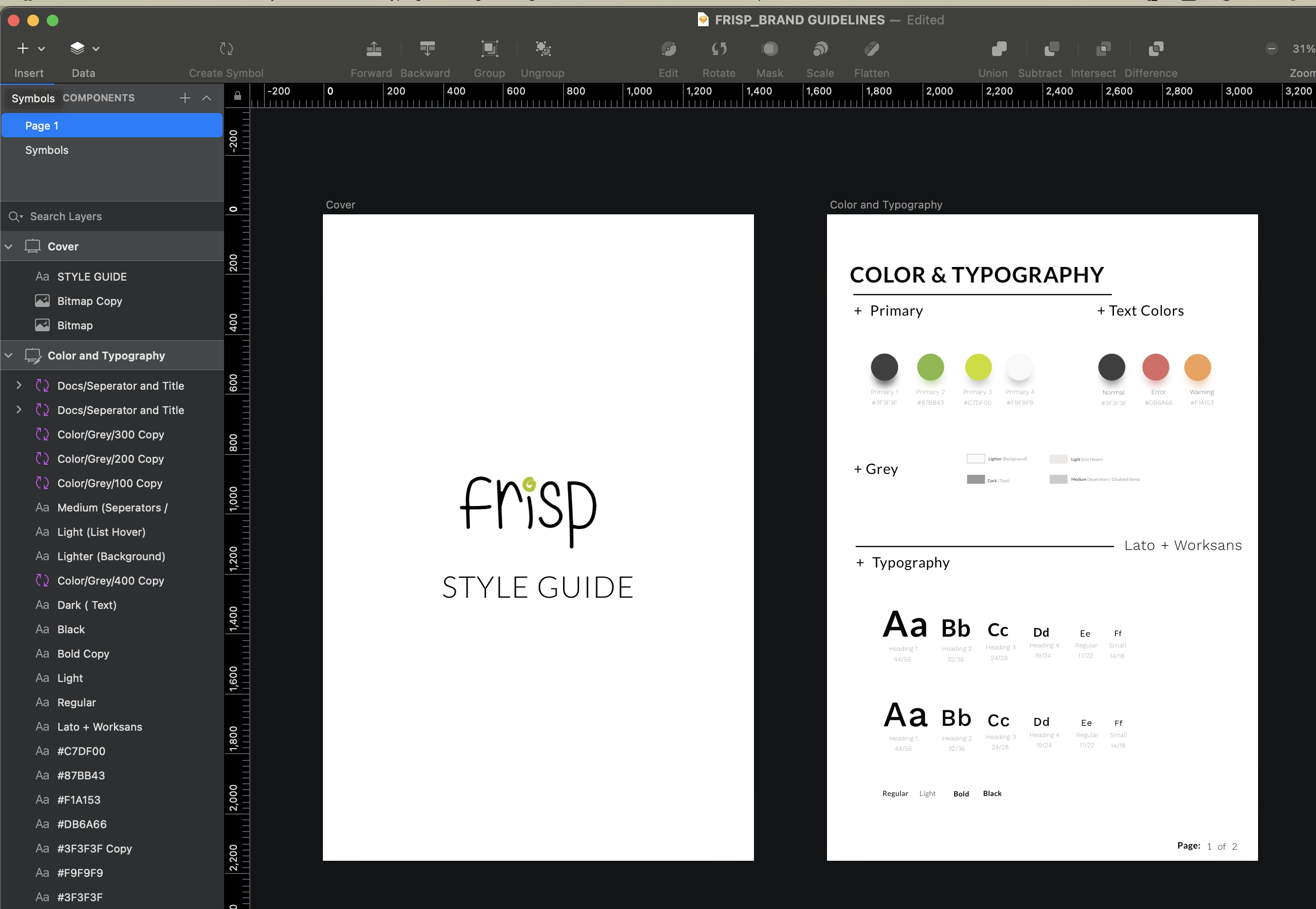
Now that we have at least one page and some form of design consistency going on, we needed a structure for the website for rapid prototyping, so we came up with a design system to aid us on design. We made sure that we created nested components/symbols so that it was highly customisable
We had first iteration done and dusted, we incorporated everything included In the design using the frisp website and decided to run the usability test it with our first set of users that were recruited. We gave participants to complete scenario based tasks that would test the usability of the main function of the website. This phase was really essential and it allowed us to make important decision on our final design.
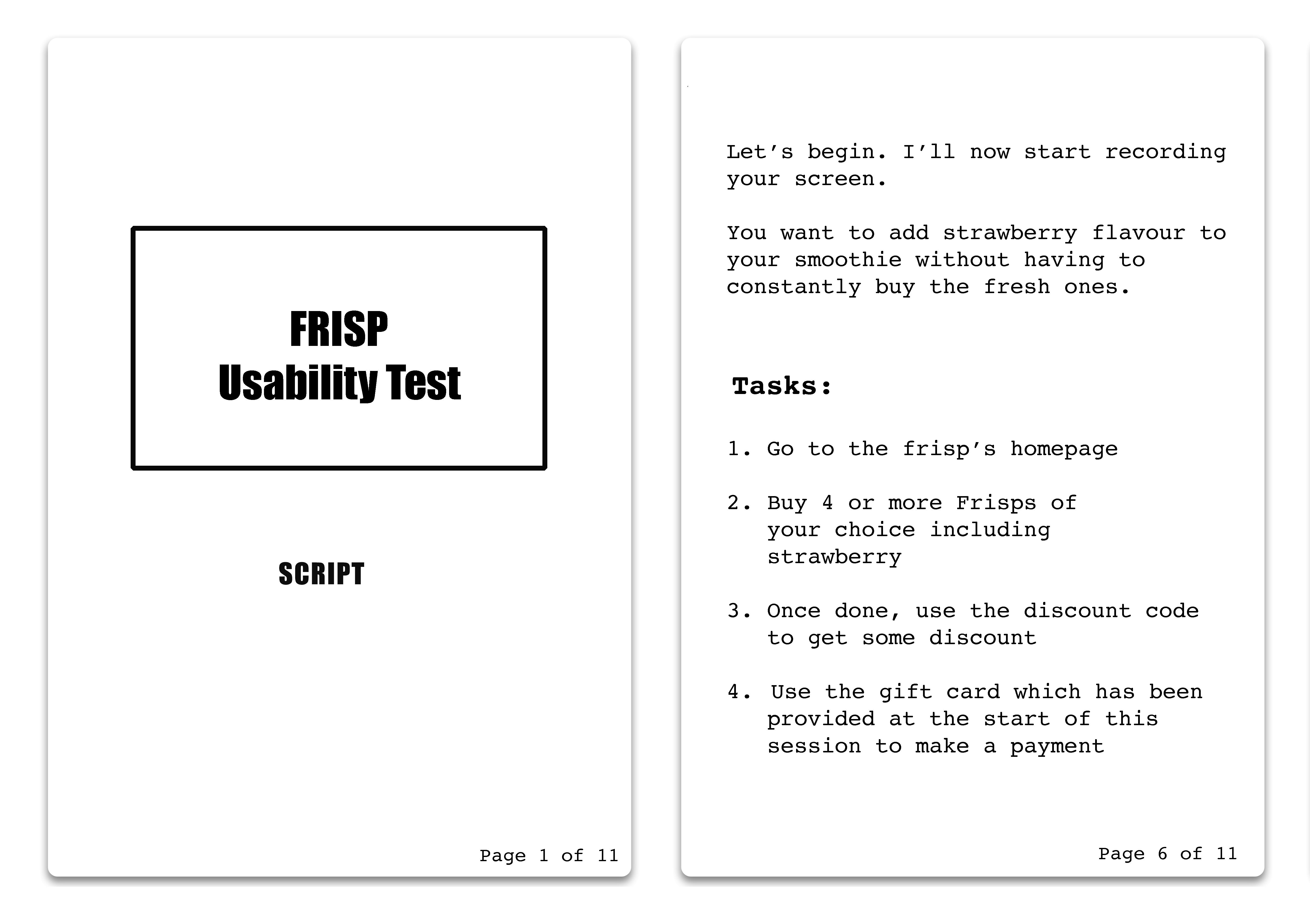
SCRIPT for usability test session
We took notes of the areas/ tasks where users were struggling and seem confused, unsure of what they were doing. The short interview session at the end of the session helped us more on figuring out what needed to be changed.
Final Design of frisp
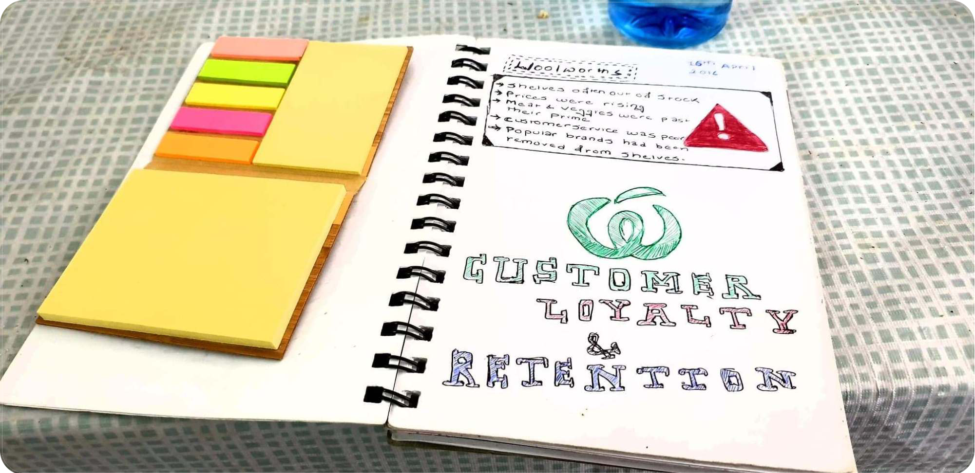 Initial Problem from Woolworths
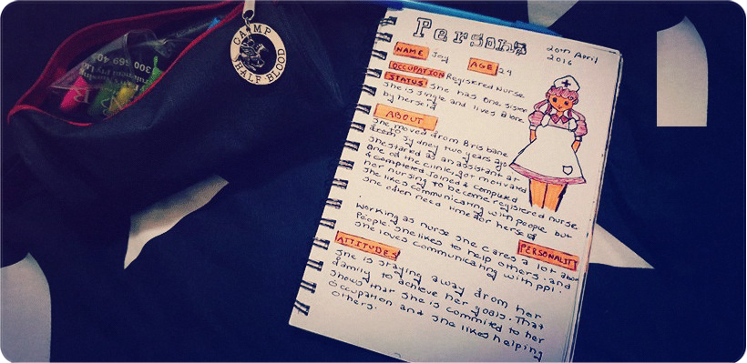
Persona Representing the User Group
Despite the given facts, they wanted us to conduct our own user research. Woolworths marketing team conducted some insight research beforehand, but the problem seemed too general and It looked as if it was out of context and we had no idea when, where, or how they conducted the research, what was the user demographics or what is and what is not data?
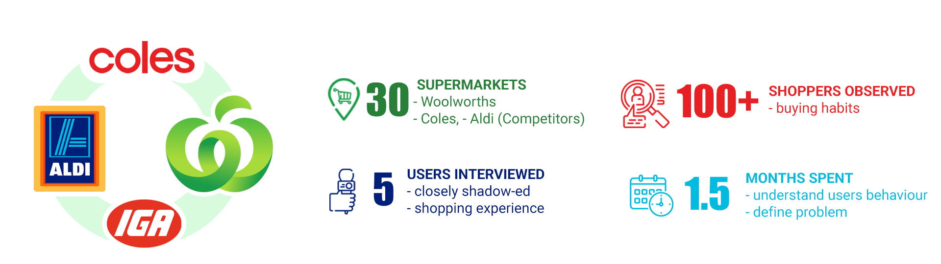
Keeping the problem provided by Woolworths in mind, our design team visited 30 supermarkets including Woolworths, Coles, Aldi, and IGA (around 15-20 mins observing customer behaviours, checkout counters and shelves) for a week between 5-7 PM as well as Early morning (Ideal time for shopping: before and after Work). We then observed the behaviour of shoppers and added it to our notes.
Note: It was just a plain observation, nothing detailed
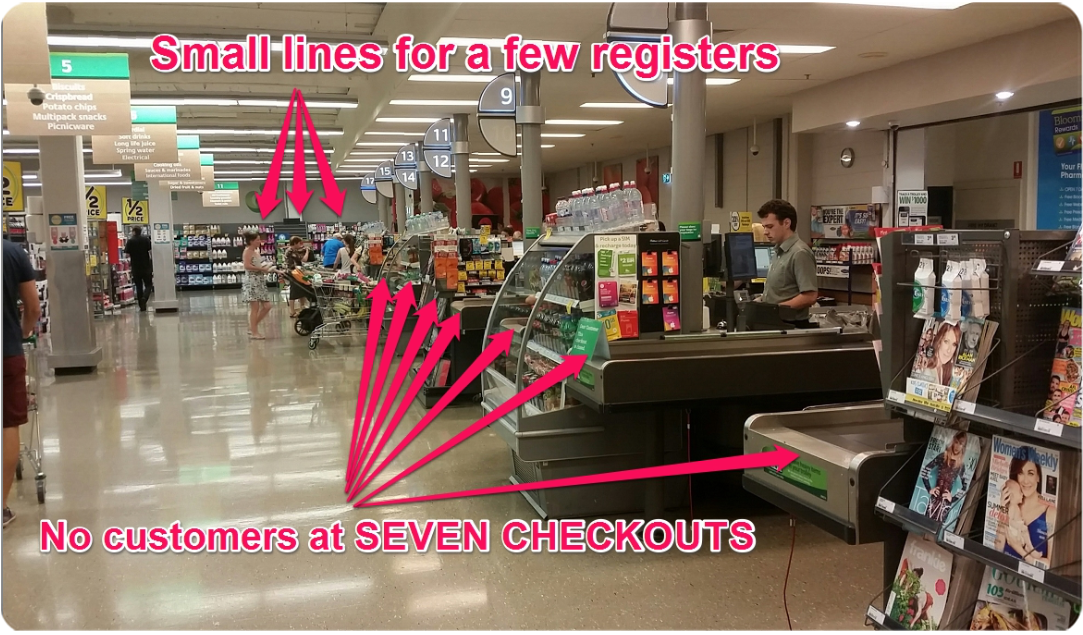
Woolies checkout counter
What was obvious during these observations was that out of seven checkout counters at most of the Woolworths, at least five of them would have little to no customers for more than two hours. However, the case was completely different to their competitors as we found their service checkout counter full of customers.
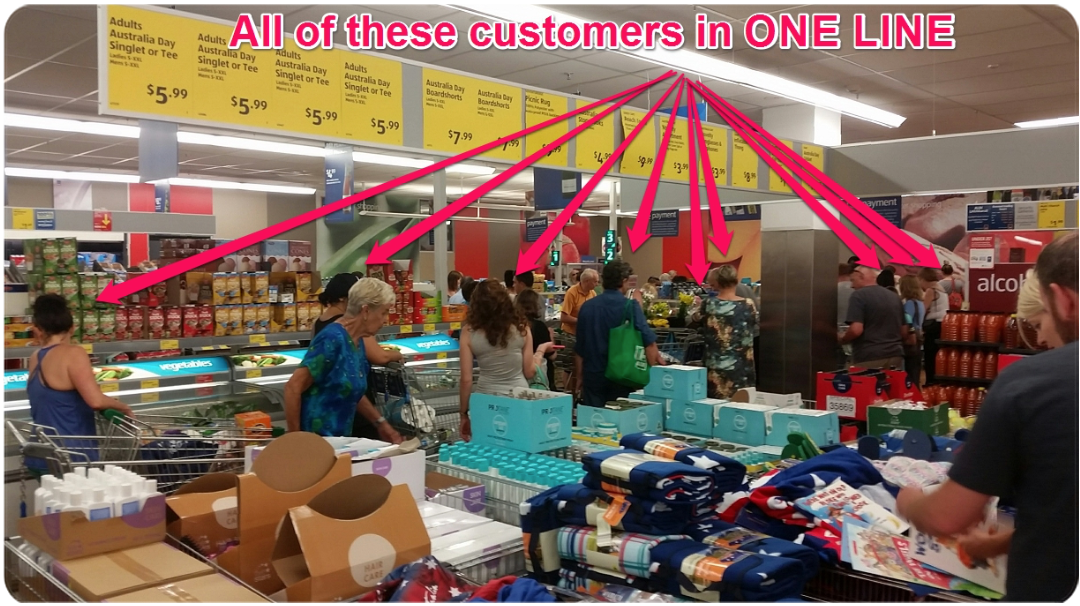
Customers at checkout: other competitors
Main Takeaway from this observation:
As reported by the Woolworths team, the fact validated that Woolworths was indeed loosing its customers to other competitors or wasn't able to make their store appealing . However what was interesting is the reasons provided by the marketing research team for lack of customers wasn't adding up i.e. shelves were found restocked and we weren’t able to find any expired product during our observation. We hypothesized that there were way too many competitors right next to Woolies stores, which might have divided the users who used to be loyal.

We also came up with 5 persona's based on this observation which were referred throughout the whole strategy-design process to recruit/validate our ideas.
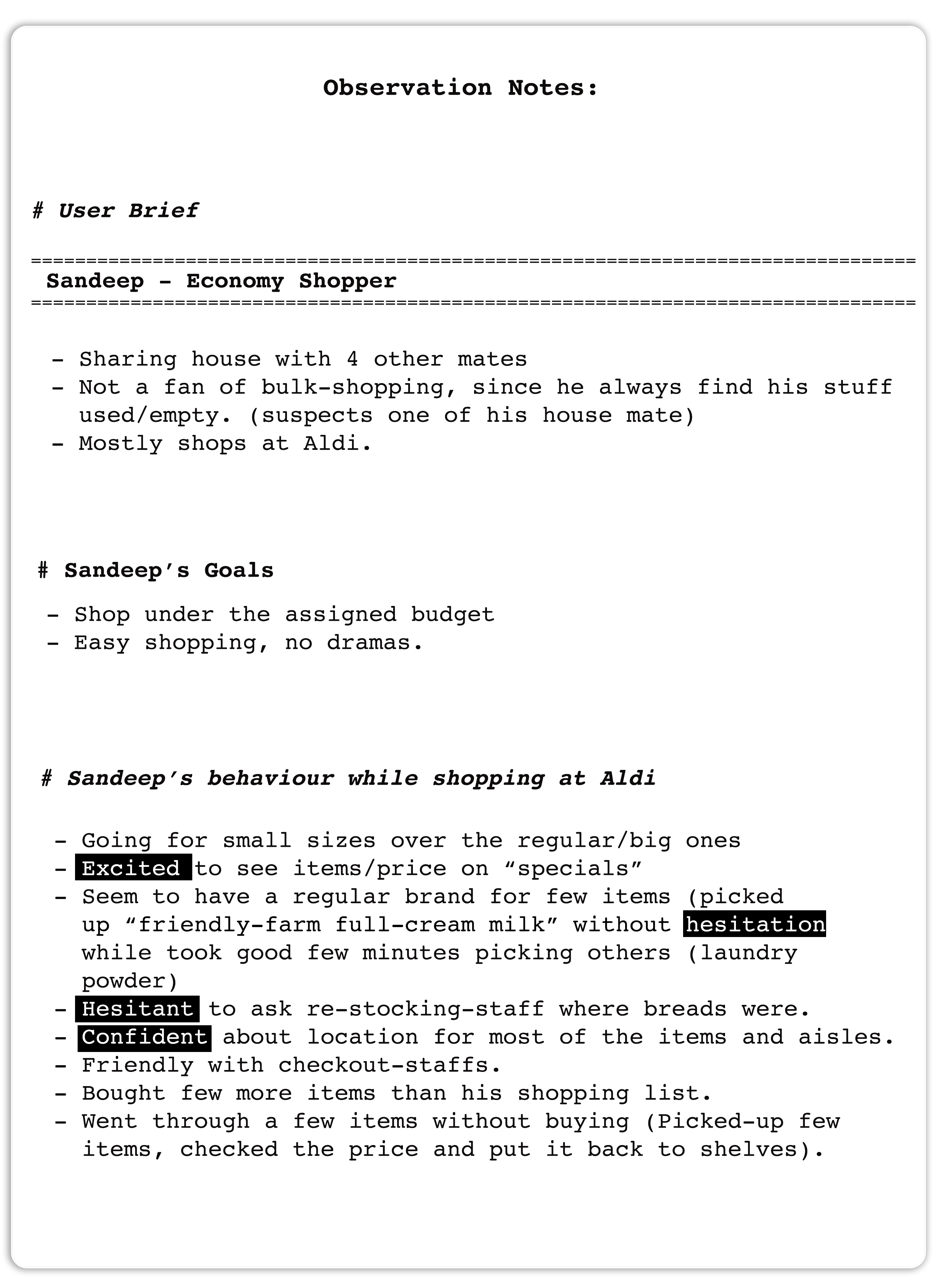
Observation notes, taken while shadowing shopper
With our written consent signed, We shadowed our shoppers, the observation notes above is the documented form of what we observed during the shopping experience.
We also used an empathy map to understand our user needs and to develop a deeper understanding for who we are building solution for. The images below shows persona and Empathy map for two of our users.
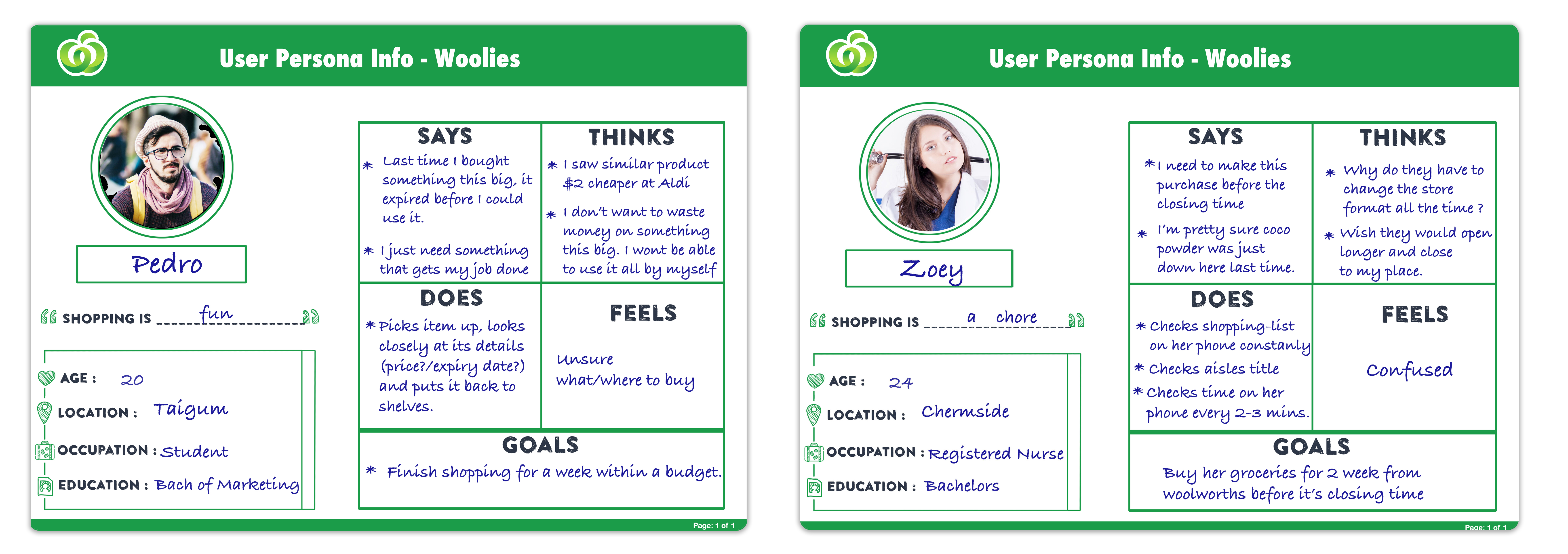
User Persona and Empathy from regular shoppers
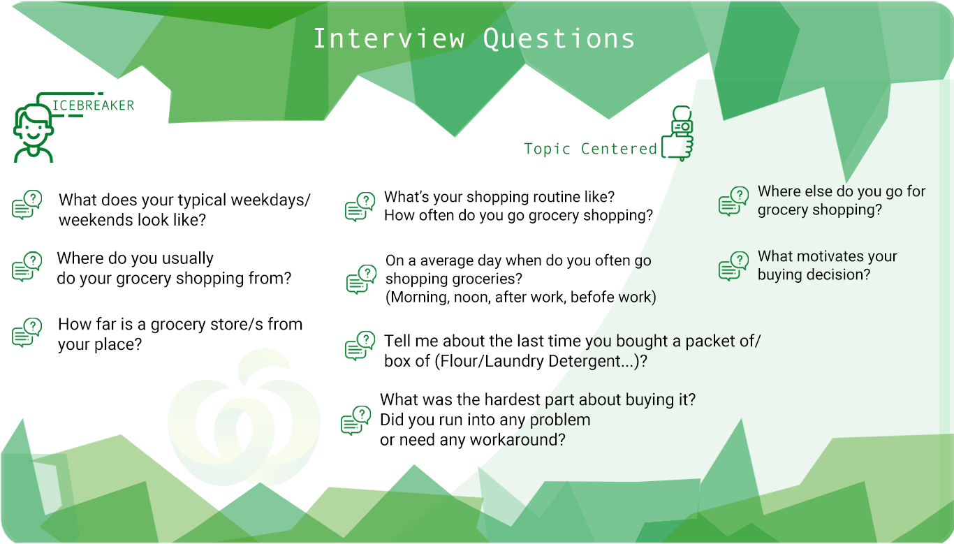
Rough guidelines for questions
We planned and created journey map for all shoppers-personas but we wont be able to include everything on this project. During this process we figured out: for some customers, the journey started right-off with Woolworths while for the others it started only when they couldn't find their desired item at other stores (competitors)
For instance for Paige even though her ideal shopping destination was on Coles. she wasn't able to complete her journey based on her expectation, and that was when she decided to give Woolworths a go. During this shopping experience with the competitor we tried to gain her insights on what excites her, what made her decide Coles was better than Woolworths, what would make her journey successful and what were the pain points we could improve.
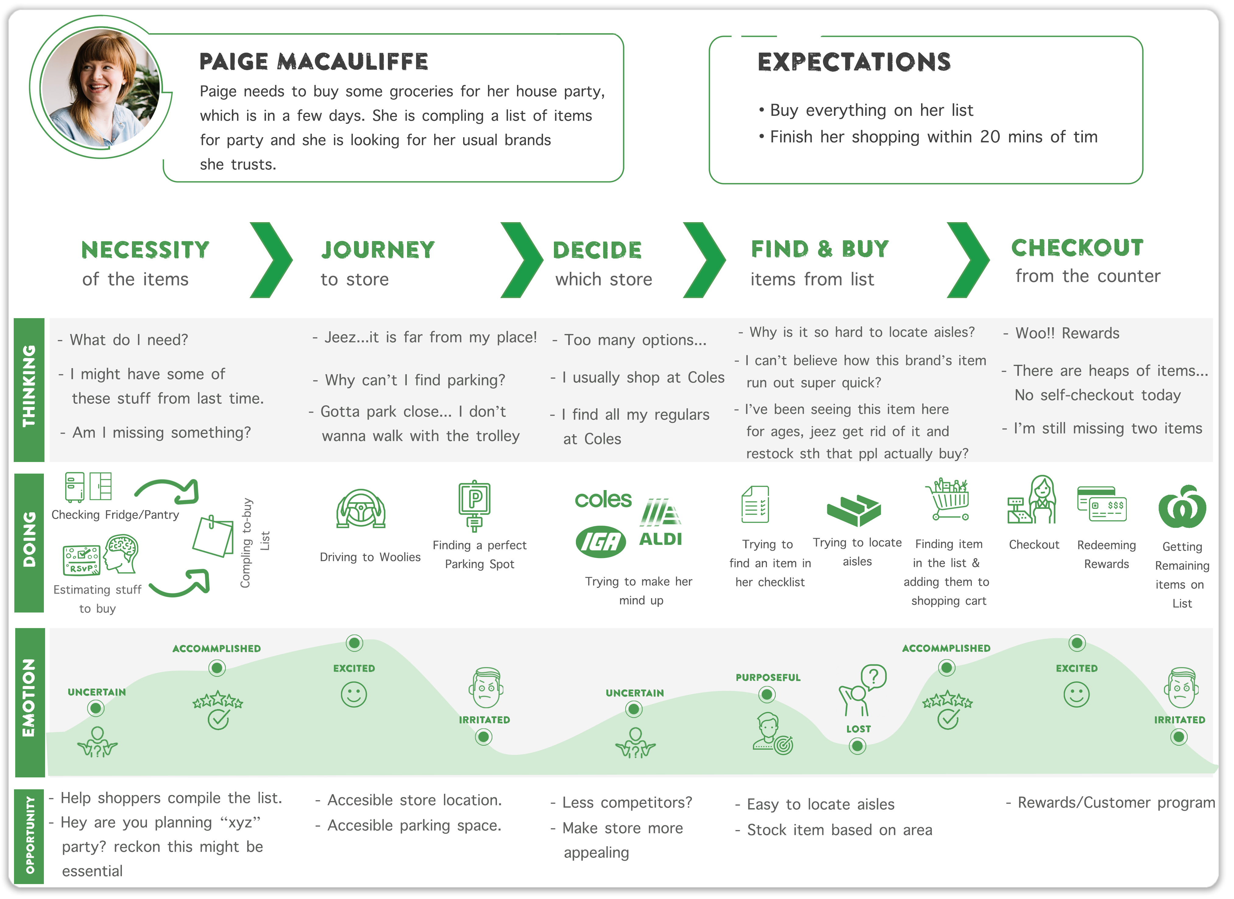
Journey-Map for user (Paige) with respect to their shopping experience
We had initial problem handed-in to us and the problems the we hypothesized at the begining after the general observation. Now that we collected enough data on shoppers habit, observation, their behaviour, their journey plan, and some insights from their interviews, it was time to narrow down what needed to be done in order to increase retention and what hinderances they were facing. For this we used Affinity wall and categorised users problems based on their nature.
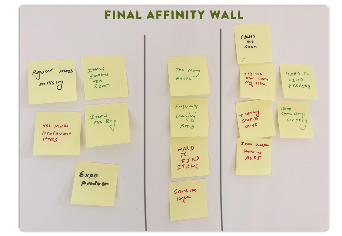
Summarised Affinity wall that represents all the problems
We classified problems of similar nature gathered from the affinity wall based on users journey/interviews and populated the table below. We thought this would help us deal with them individually and in a way that we could diagnose them on the basis of the structure (which part of Woolworths, does it concern to? management, stakeholders, store-front or customers habit) to help us design the strategy.
| Pain Points | Relating to |
|---|---|
| Product | • Expensive products • Missing regular items • Items too big • Expires before the usage date • Heaps of Irrelevant items. |
| Store location & Layout | • Crowded Stores • Frequently Changing Aisles • Hard to find specific items • Stores way-too large to find any items. |
| Competitors | • Closes way too soon • Not convenient (location wise) • Hard to find Parking-Spot • Competitors (right next to each-others) • Price difference (with competitors) |
Based on our conversation with Pedro, his problem (Woolworths not being his ideal shopping centre) and implementing the n(whys) technique, we could clearly see that the problem wasn't on the customer side or the store instead it was a problem relating to size of product which needed to be fixed from suppliers side. This method was perfect for us to direct the problem based on the nature

5why interrogative technique
To prevent the unnecessary cluttering of this case study and to reduce the reading time, we haven't included every bit of questioning section in this part. The problem statements below is how we re-framed the initial problem statement to question.
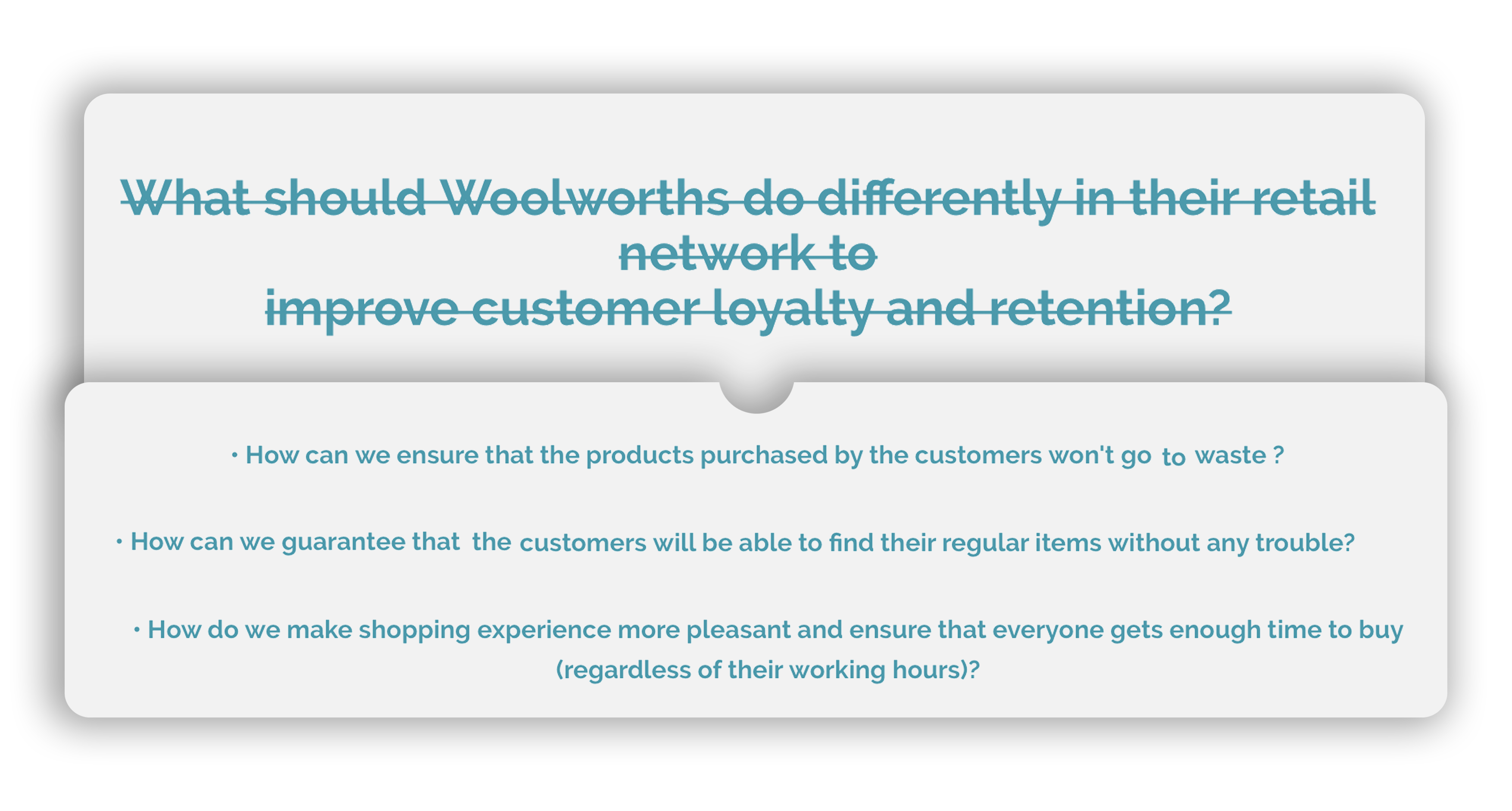 Reframed Problem Statements
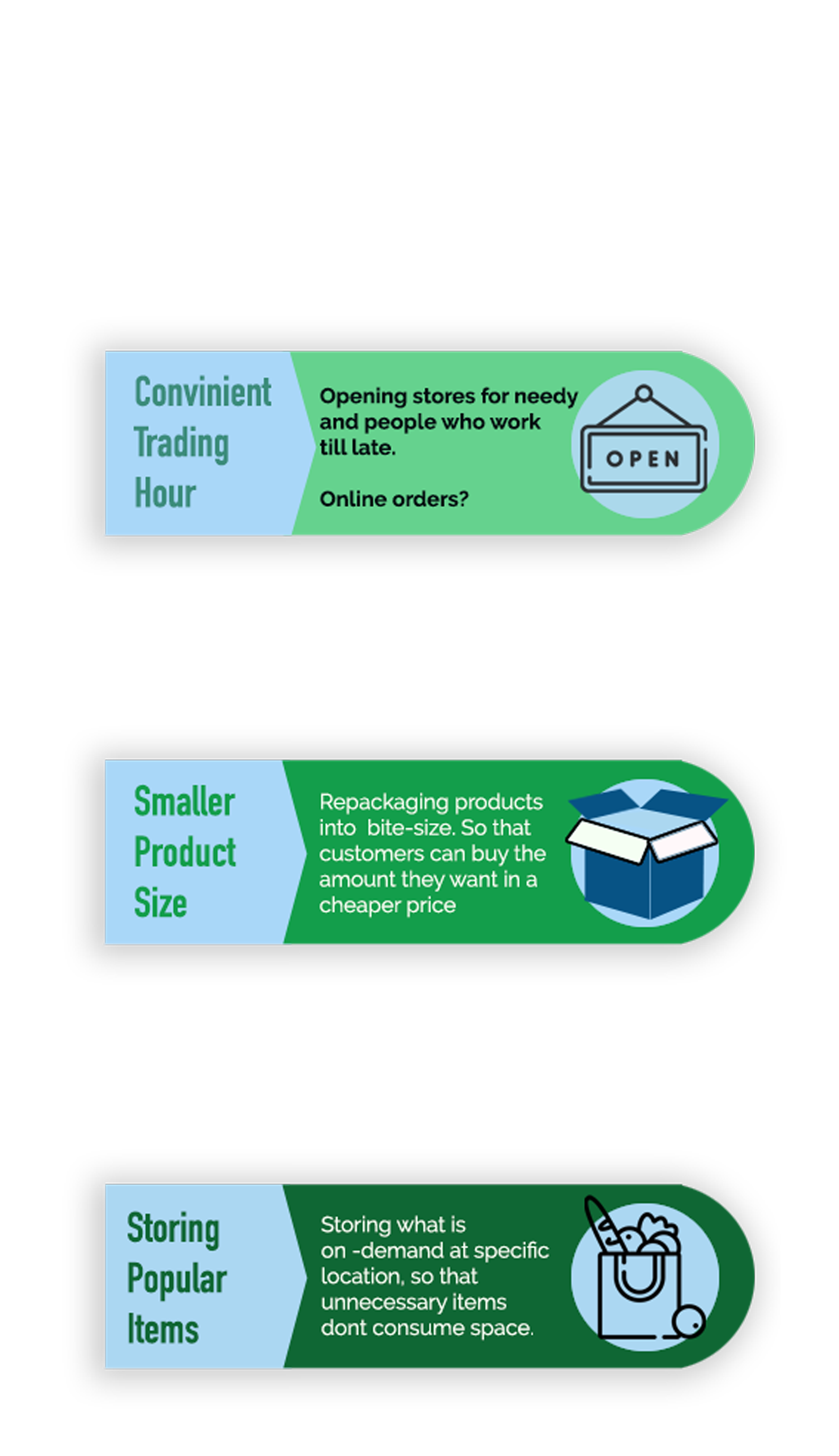
Solutions to overcome problem
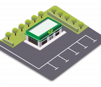
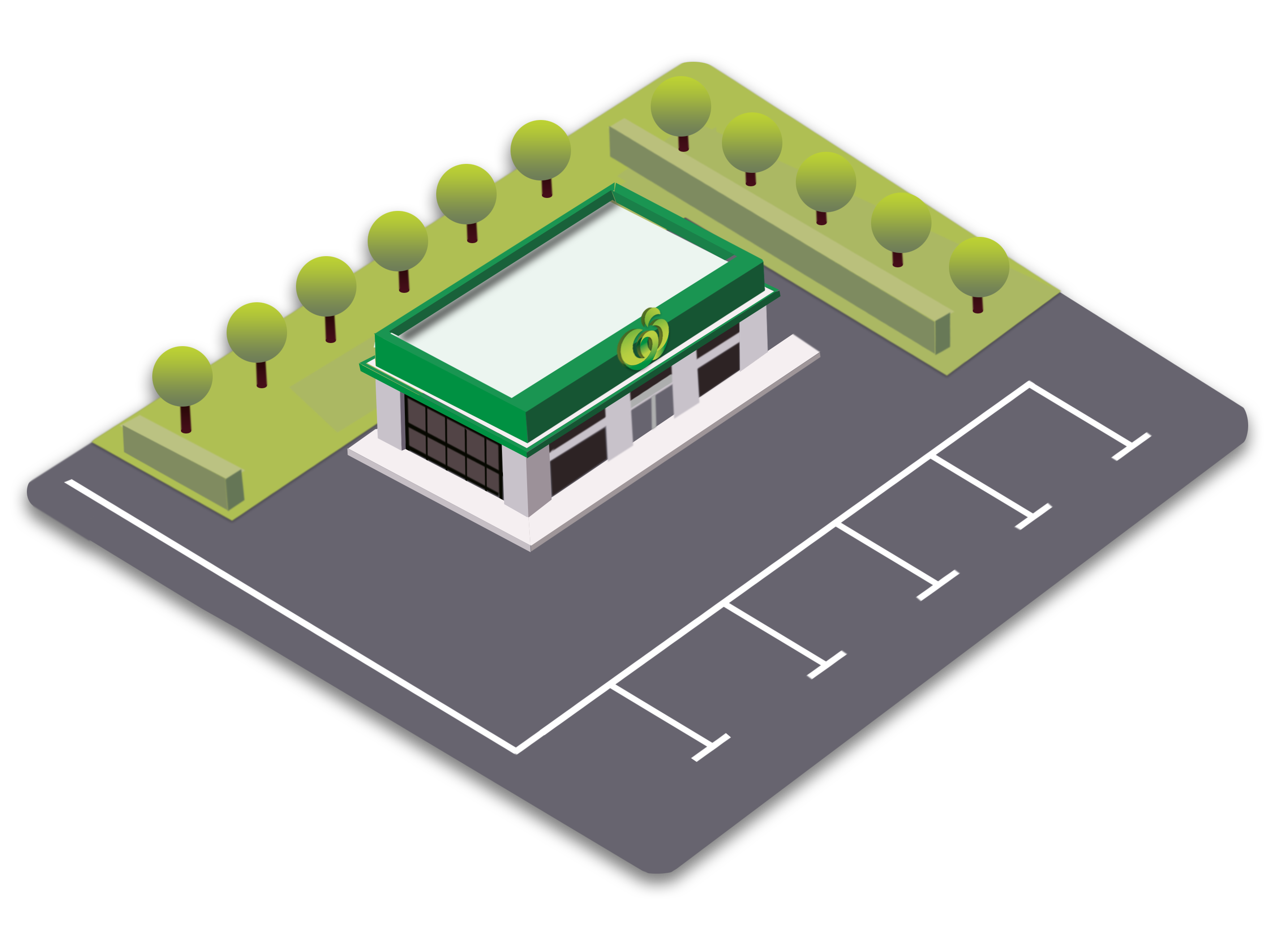 Prototype - Woolworths convenience stores (solution)
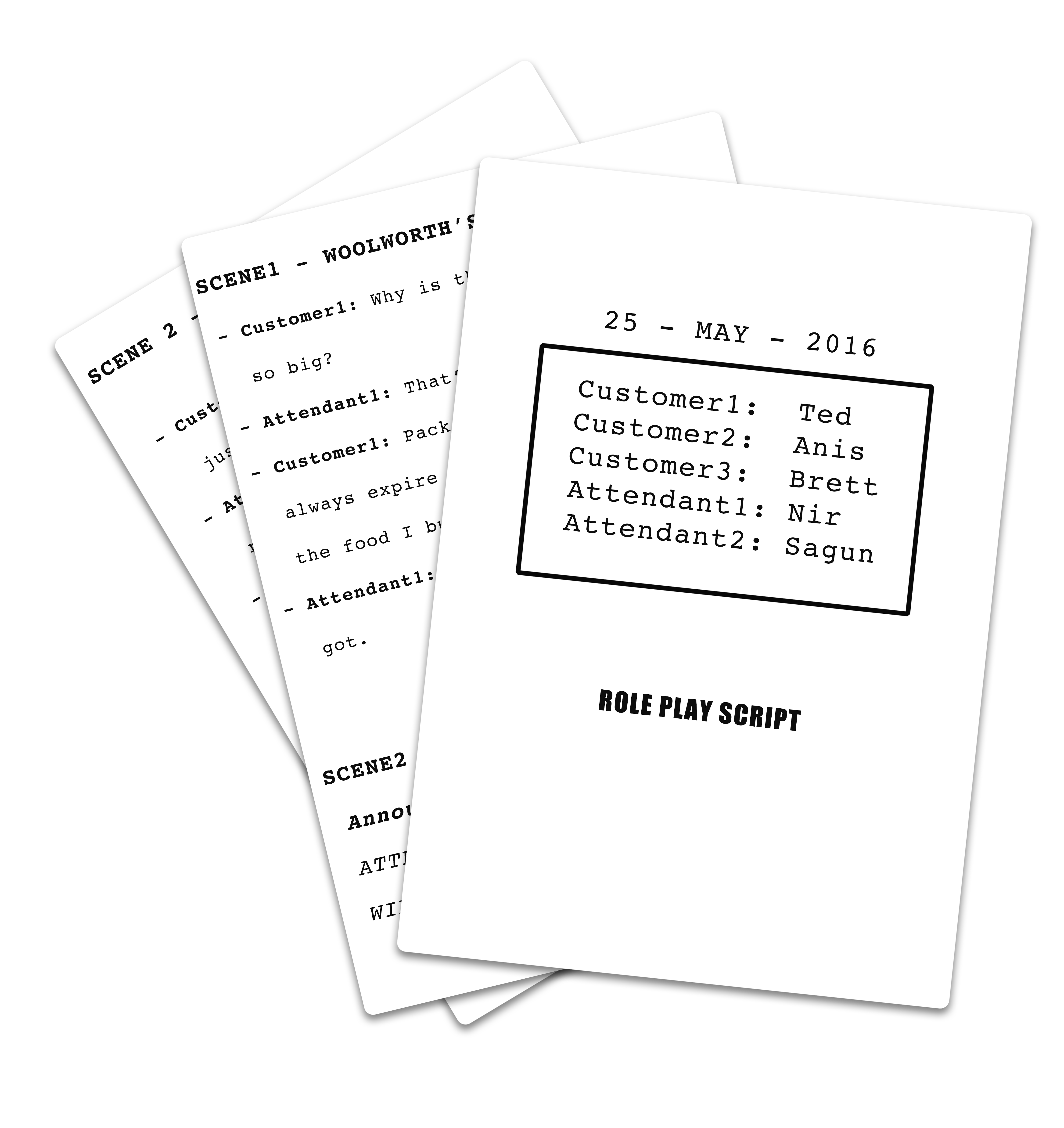
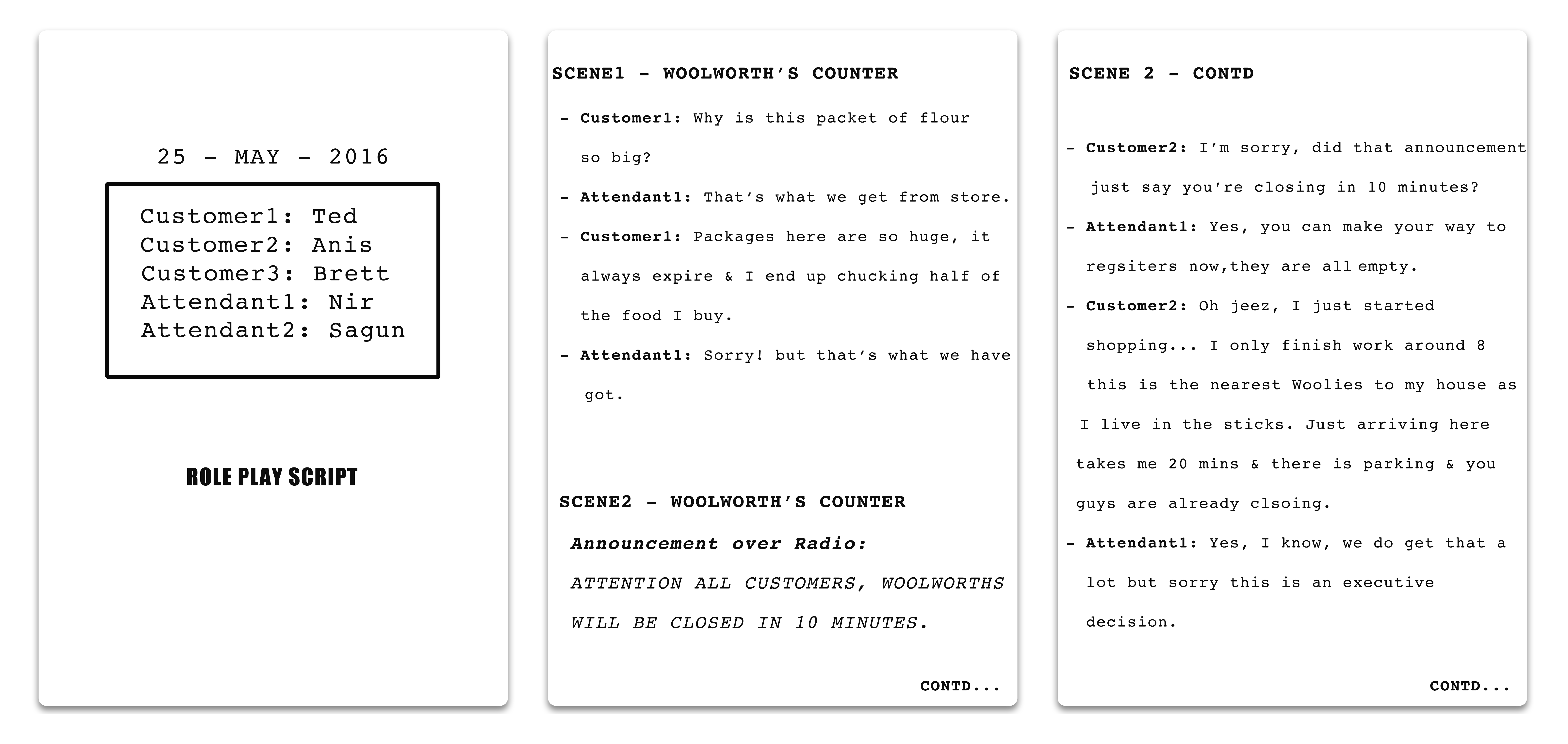
Role-play script
All of the research data, solutions and prototypes were handed-in to the Woolworths group. Since this project was extremely big and had to be implemented from the higher-level and it required approval from all the board members , we couldn't get the initial feedback. Our suggestion to Woolworths group was to test the idea on one store for a couple of months and see if it would be successful.
Update: Although we can't be too sure about it (since Woolworth is not vocal about how they came up with the idea), Woolworths decided to rollout Metro by the end of 2016, which practically follows same concept and idea and so far has been proven to be successful.
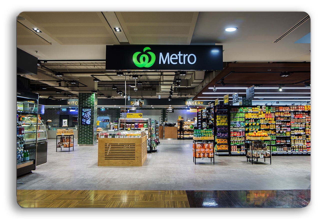
After the introduction of convenience store format Woolworths group has increased retention by 17% of that to the previous year (just within metro) and they decided to open six new Metro stores according to their Annual report for the year 2017
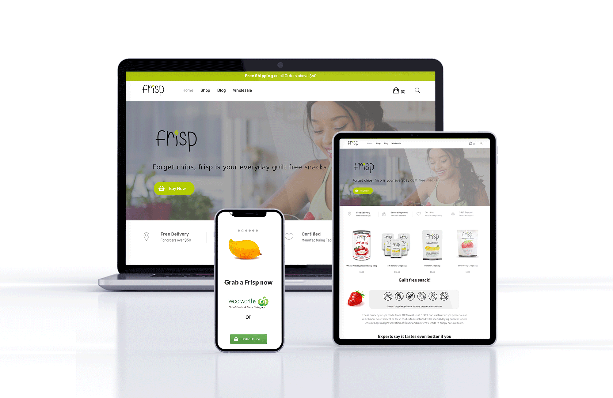
 Sold in major Australian Supermarkets including Coles and Woolies
You must be logged in to post a comment.