 Product Design
User Research and UI Design for Rebranding Project –…
- May 12, 2020November 19, 2021
- by Sagun Ghimire
Date
Dec 2019
Duration
3 Months
No of Designers involved
1
My Role
Product Designer
Bit of a context
frisp.com.au, an Australian food brand that focuses on building a healthy snacking habit on children,
was going through a major rebranding. This project is a part of a big rebranding project including logo design, packaging design, and strategy design.
Initial phases of rebranding i.e. Logo and Packaging design were already rolled out and it was already showing positive results with increased sales (Since this was a big project we won't be talking about the first two phases in this project).
DESIGN PROBLEM
Sure, the rebranding was yielding good results, but despite having proper/updated SEO strategy, AdWords, and everything correct, the Frisp website was still not gaining enough customer attraction. Frisp marketing team simply wanted us to redesign in order to make it more appealing. We knew we had to redesign the website to reflect new rebranding scheme but that just wouldn't suffice.
KEY GOAL
Our key goal was to design the website consistent to physical rebranding, by finding out why users were not purchasing from the online website.
MAKE OF THE TEAM
I worked as a Product Designer throughout the design challenge. I was accompanied by a graphic designer and a marketing team. I produced all the deliverables included in this case-study and presented it to the clients (for every iteration).
UNDERSTANDING THE USER
Bit of a context
Our user research team agreed to aid us on finding user group for our design excercise, based on the data provided by our research team at the end of the research we found that the users for our Frisp website were aged between 25-44. Potentially parents of children and fitness enthusiasts.
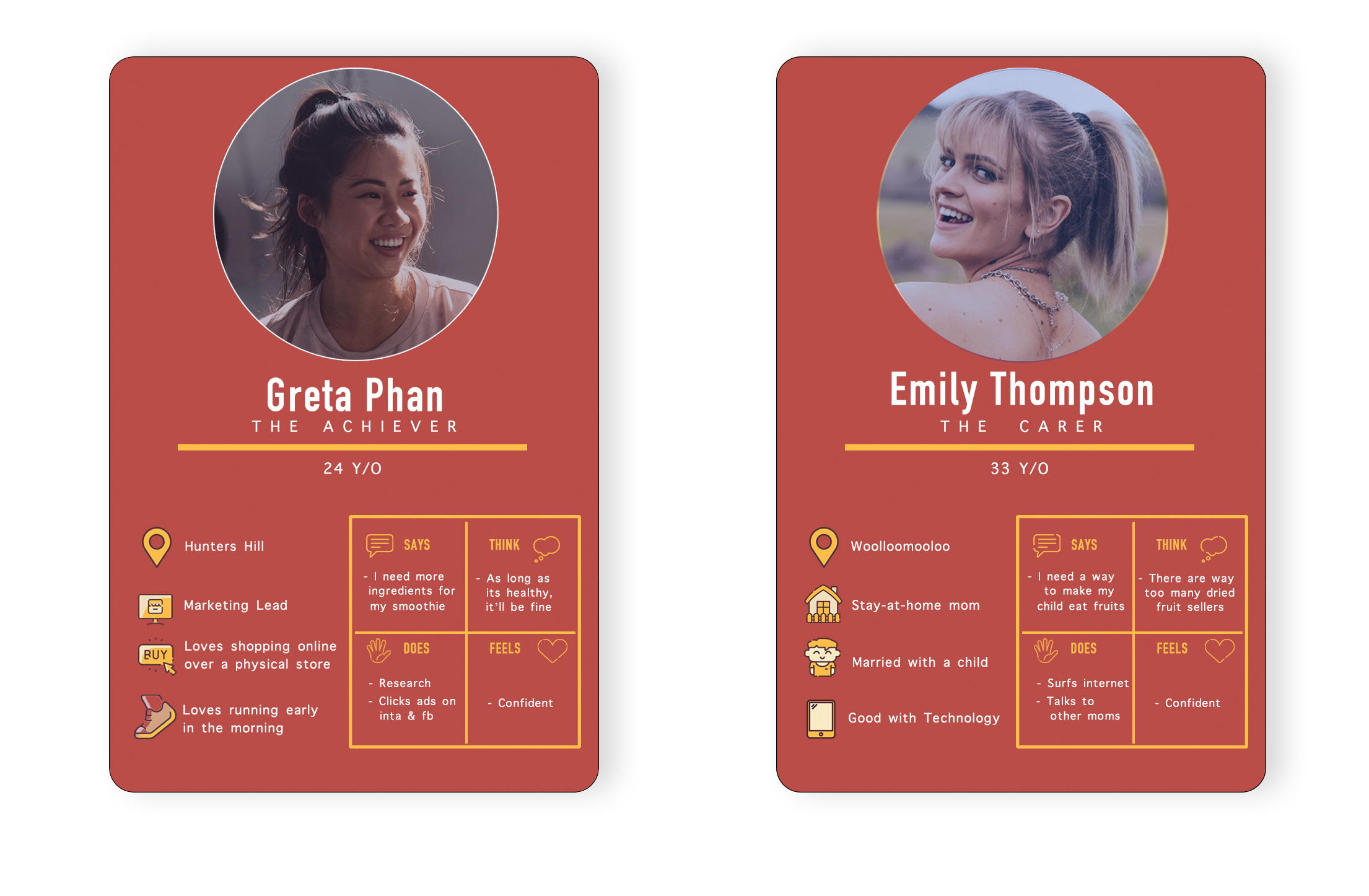
Persona Representing the user groups
INITIAL OBSERVATION
USER PERSPECTIVE
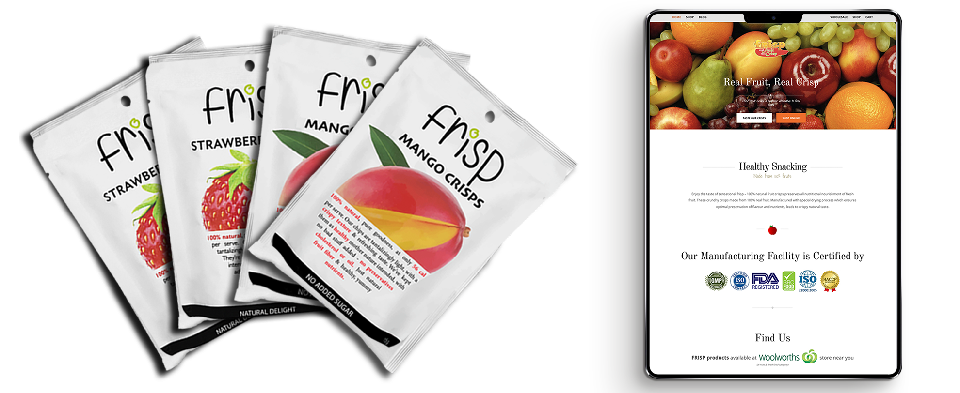
The design of an existing Frisp website (Right) didn’t comprehend the packaging (Left)
DETAILED OBSERVATION
DESIGN PERSPECTIVE
In this phase of our design process, we will be looking into common design/usability flaws in the existing frisp website. The whole purpose of this design exercise was to aid user-researchers on their research process and help us find out common flaws to help us prevent these issues on the redesign of the website.
We will be dividing the initial page of frisp into 4-sections: Navbar, Hero section, Content and Footer and look at them individually to look at the usability flaws.
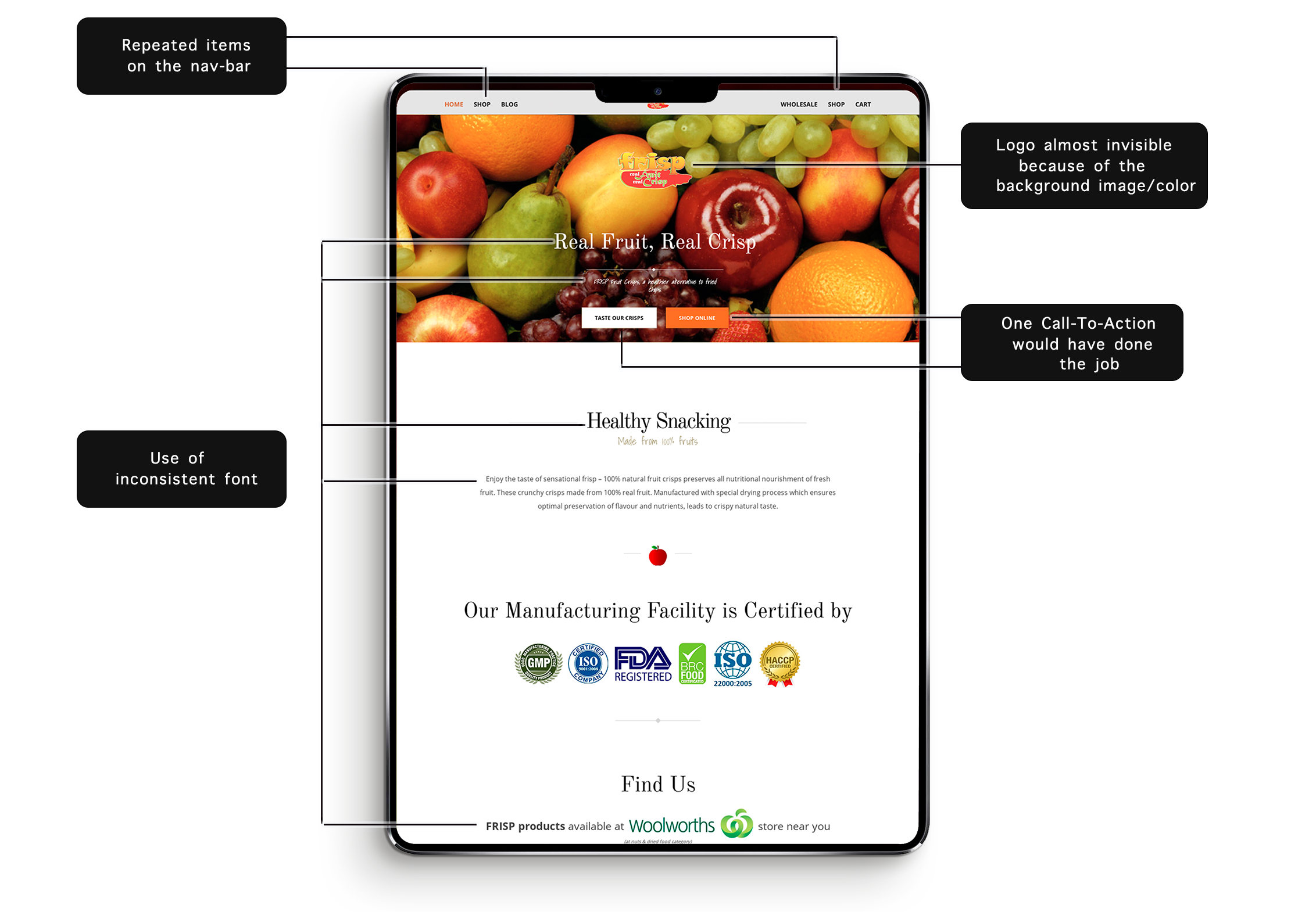
Design flaws/recommendation in existing frisp website [ navbar, hero, and content section ]
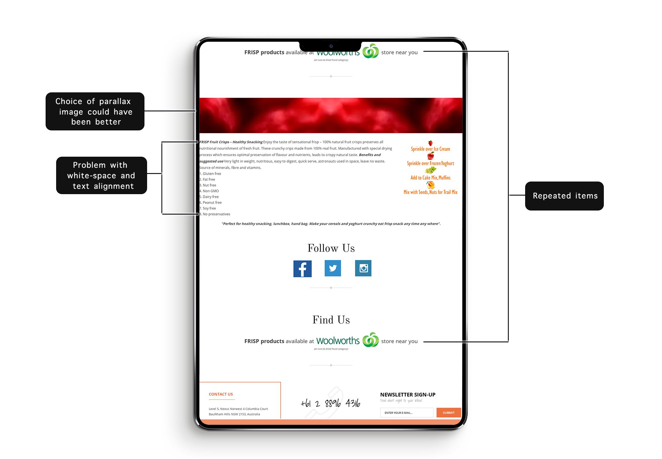
Design flaws/recommendation in existing frisp website [ content section and Footer ]
DETAILED OBSERVATION
HEURISTIC EVALUATION
We conducted heuristic evaluation as a part of usability test on our old frisp website. We used Nelson's Heuristic evaluation framework as a guiding principle for this evaluation.
We hired 3 evaluators based on our persona sheet, and each of the evaluators were called-in at a different time of the day. The reason behind calling evaluators separately was to avoid them talking with each-other to avoid influence on their test result and also to make sure that an observer could watch whats going on with one participant at a time. During the evaluation, the evaluators would share their finding/comments to the observer and the observer would record/note the findings down. Other than that there were no communications between observer and evaluators.
Note: The name of evaluators have been changed in order to protect the confidentiality.
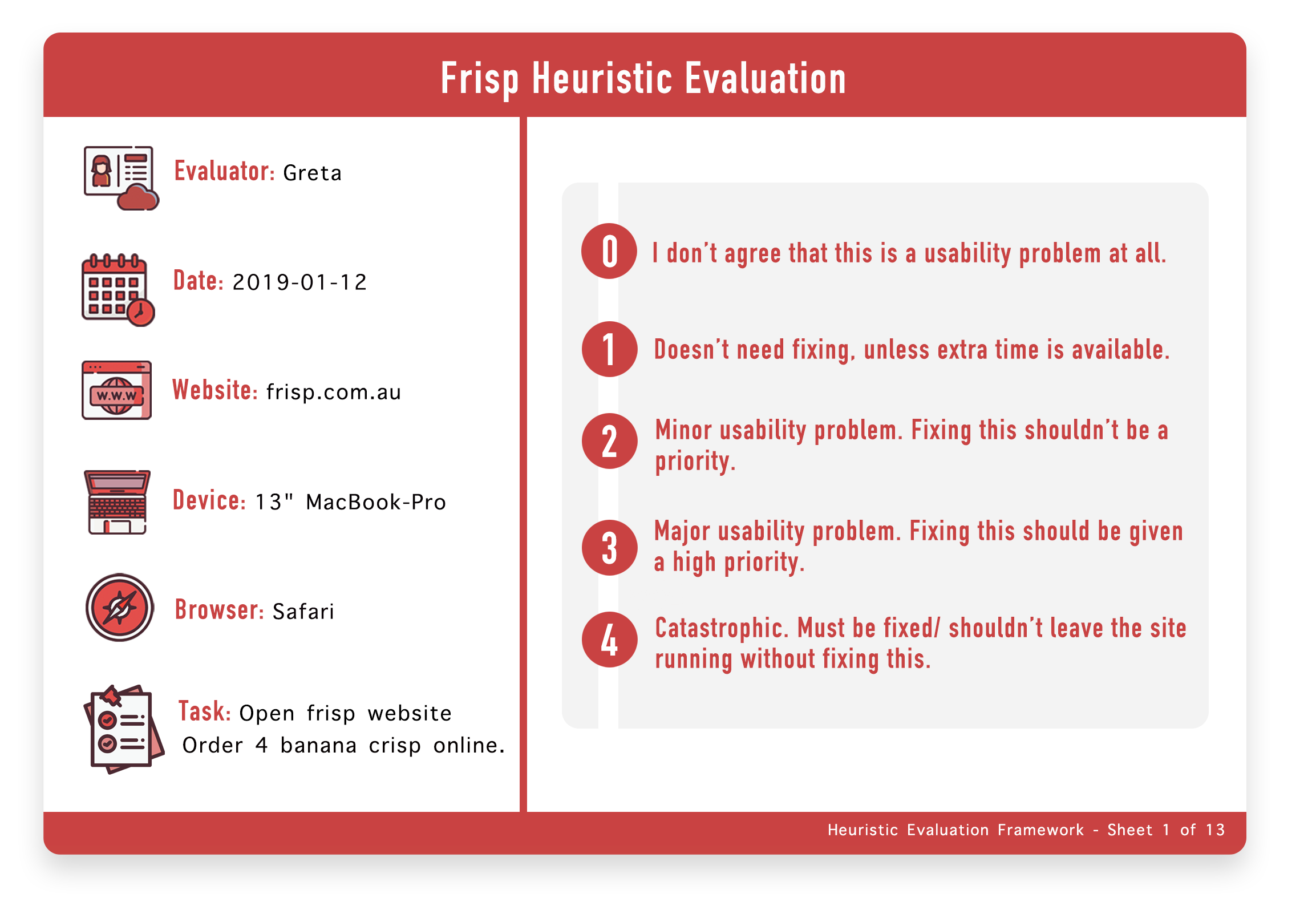 Heuristic Evaluation sheet 1 with grading criteria and basic details
The picture above is the first sheet of heuristic evaluation out of 13 sheets which displays the details of user testing that was conducted with the evaluator. We wont be including every single sheet in this project since the whole portfolio project will have insane amount of images. We will instead include relevant pages out of the evaluation.
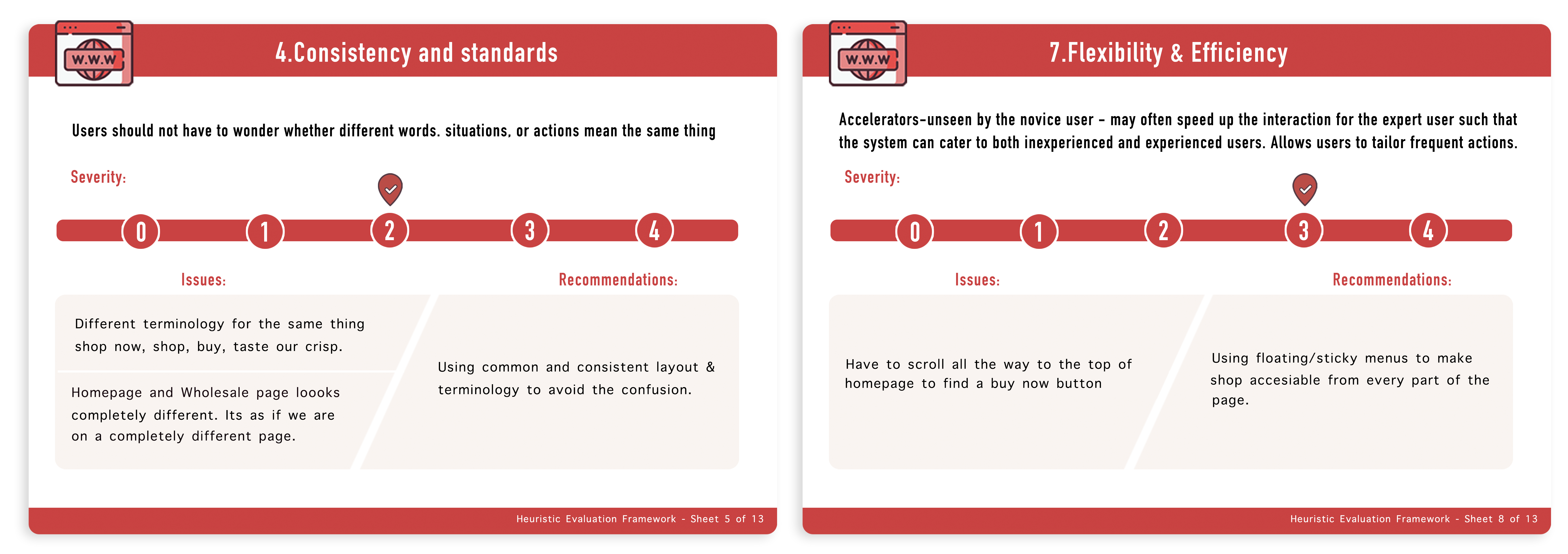
Heuristic Evaluation sheet 5 and 13 with issues criteria and basic details
Main Takeaway from this observation:
Based on heuristic evaluation and our observation on the design of the frisp website here are some takeaways we collected in frisp’s existing website:
- Usage of way too many font-styles or inconsistent fonts choice
- Color combination of Hero Image Text and Background image seem to be problematic
- Ambiguous buttons as well as multiple Call-To-Action with the same functionality (serves no purpose)
- Lacking actual image of product on homepage, which seem to confuse visitors if they have landed on the correct phase
- Users had to scroll all-the-way to the top of the website to navigate to the different page
- Homepage, blog and wholesale looking completely different (leaving users confused if they are on different website/ads?).
We will be taking all of these problems/issues into consideration for the redesign of Frisp.
Re-framing the Problems
Based on all the data we collected we tried reframing the problem, so that every time we are about to make any decision, we would think of this question in our head and see is it contributing to what we are trying to achieve.
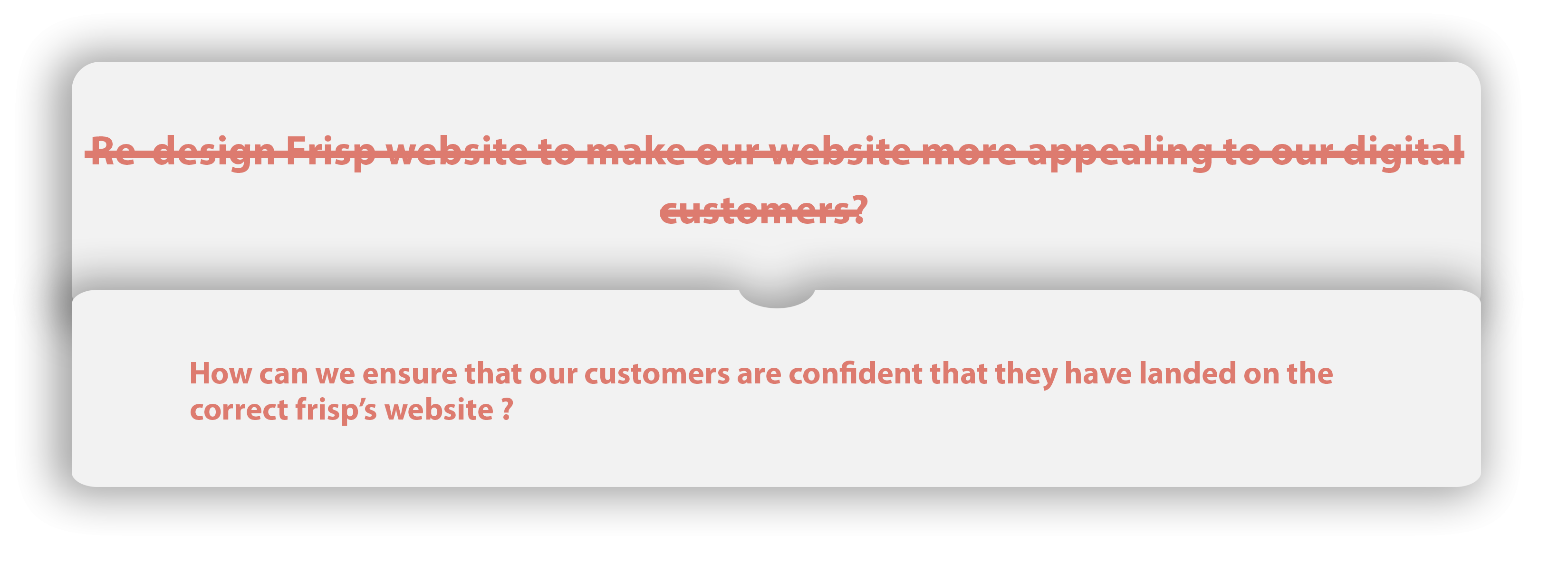
Reframed Problem Statements
Lo-fi Prototype
We started with some Lo-Fi prototyping simply by using a texter and our drawing board. We came up with at least 6-sets of wireframes and decided to proceed with the ones below. The whole concept of these prototypes were to make sure, that we get the initial ideas or basic picture of what the site is going to look like. we haven't used any colours and have left the components and other detailed ideas of website so that we don't get attached to any designs that has been done. We were sure that these wireframes from the initial prototyping phases were going to be changed in an immense amount once we start building the visual design.
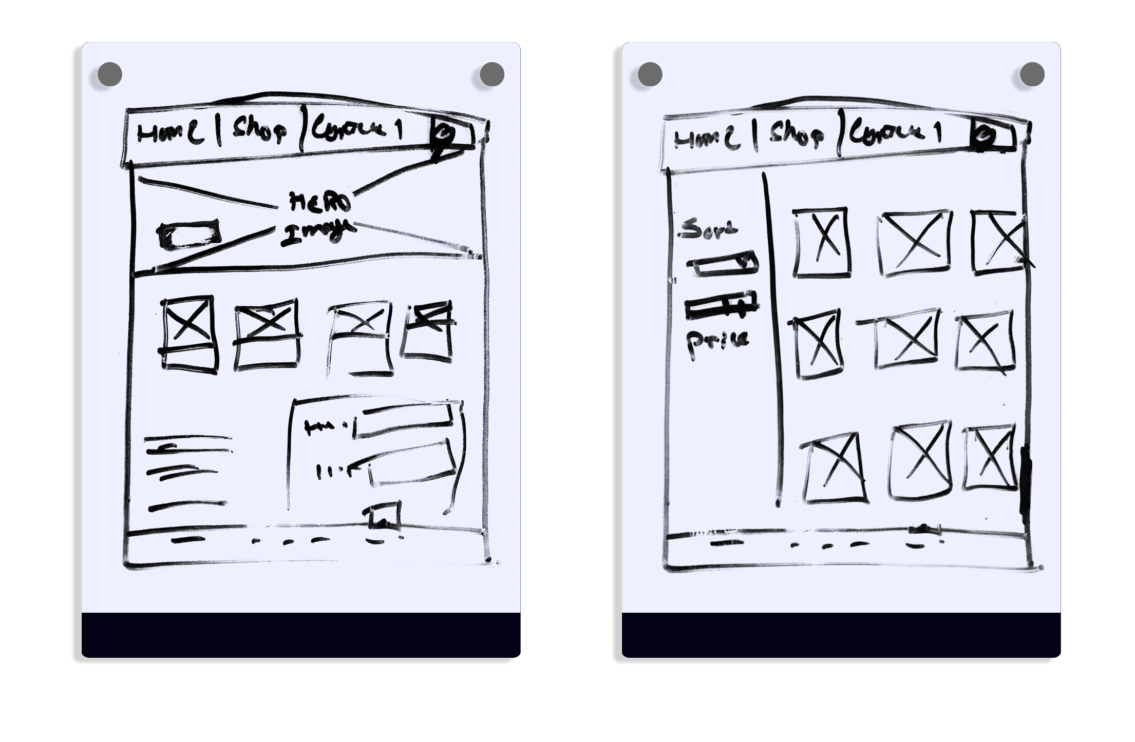
Initial concept of Home and Shop page
Hi-fi Prototype
The lo-fi wireframes were enhanced into Mid-Fi prototypes to get an approval from the board, which was to be further designed into a Hi-Fidelity prototype. We started working on our first version of our frisp_high fidelity prototype. The picture below is our first version of the prototype.
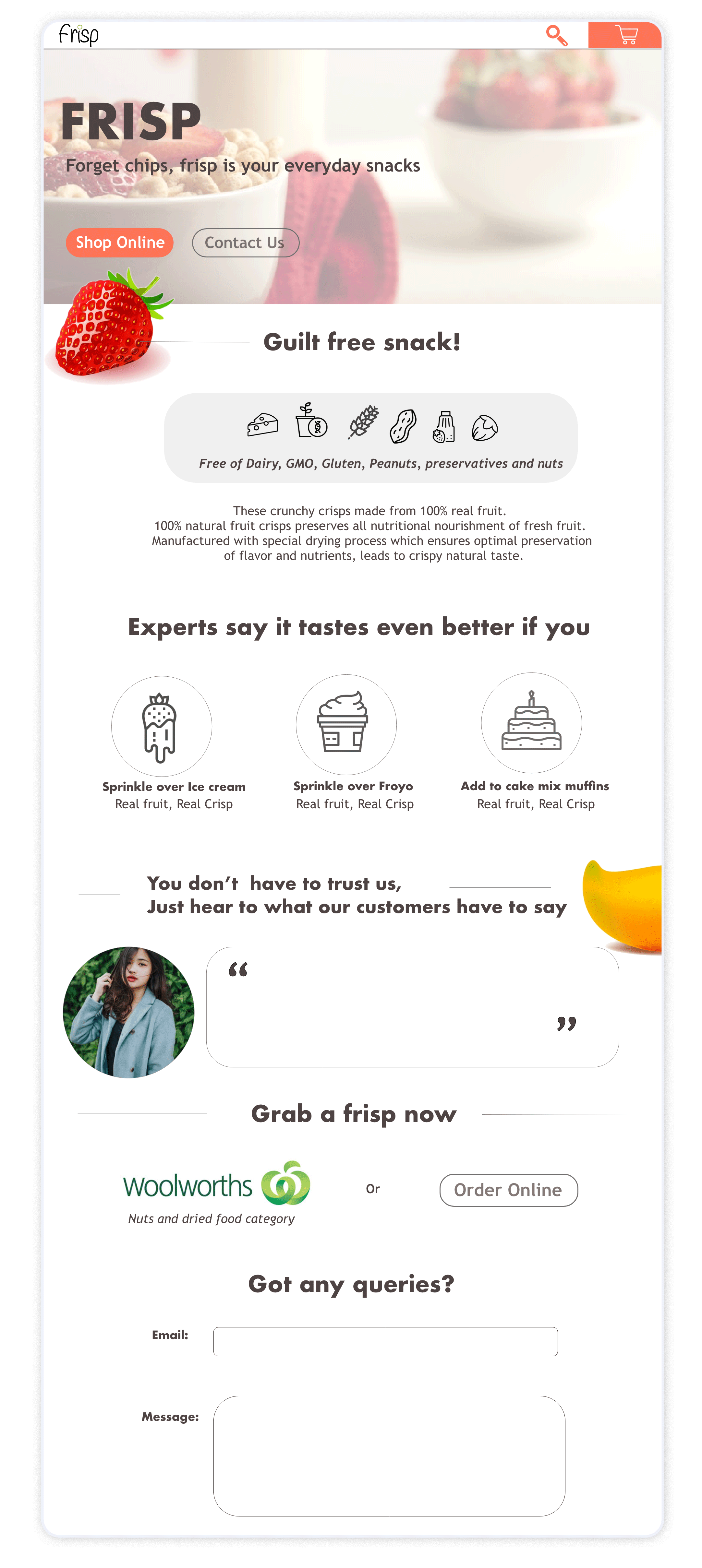
Initial concept of Home page
Design System
Now that we have at least one page and some form of design consistency going on, we needed a structure for the website for rapid prototyping, so we came up with a design system to aid us on design. We made sure that we created nested components/symbols so that it was highly customisable
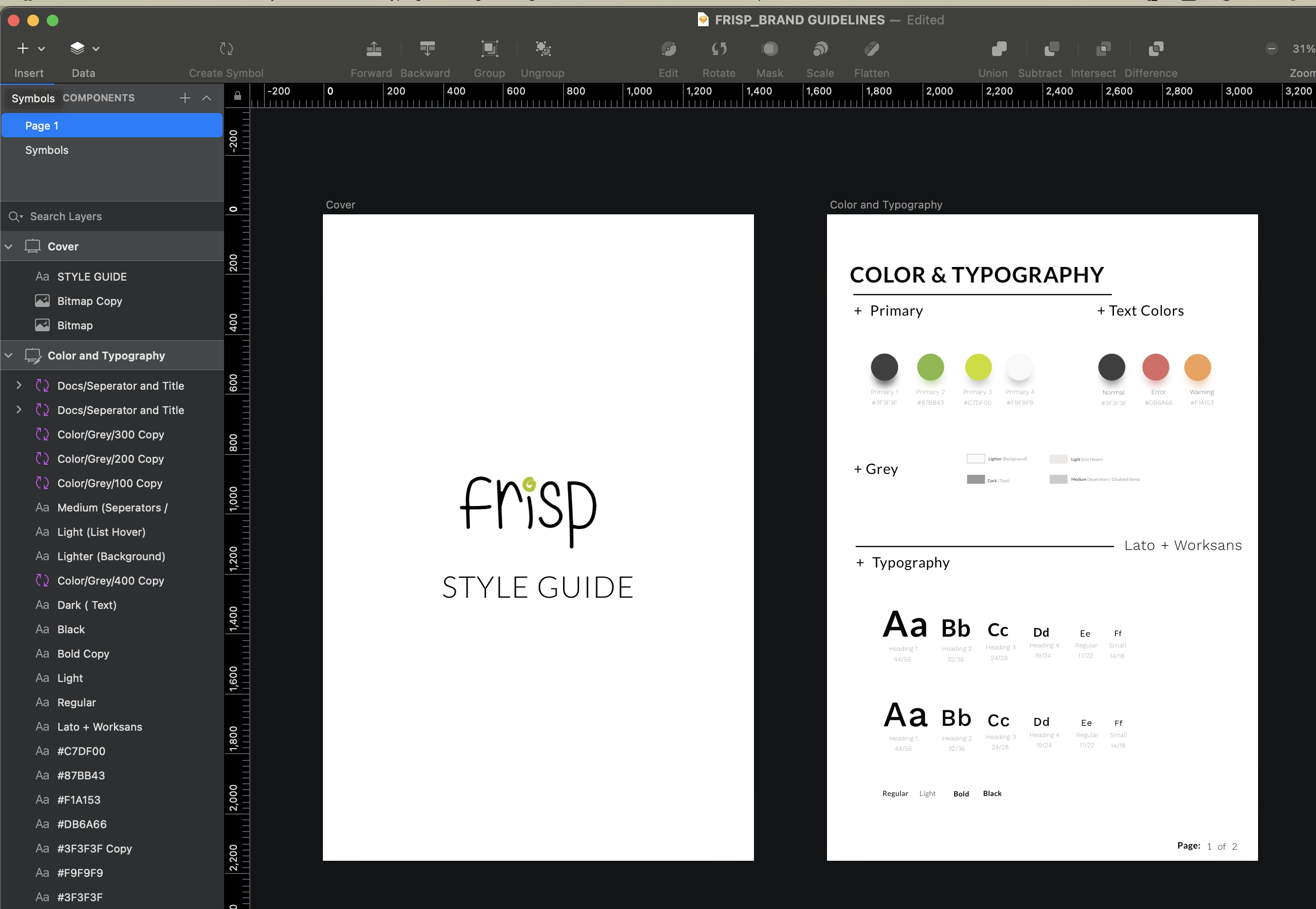
Design System Using Sketch
USER TESTING
We had first iteration done and dusted, we incorporated everything included In the design using the frisp website and decided to run the usability test it with our first set of users that were recruited. We gave participants to complete scenario based tasks that would test the usability of the main function of the website. This phase was really essential and it allowed us to make important decision on our final design.
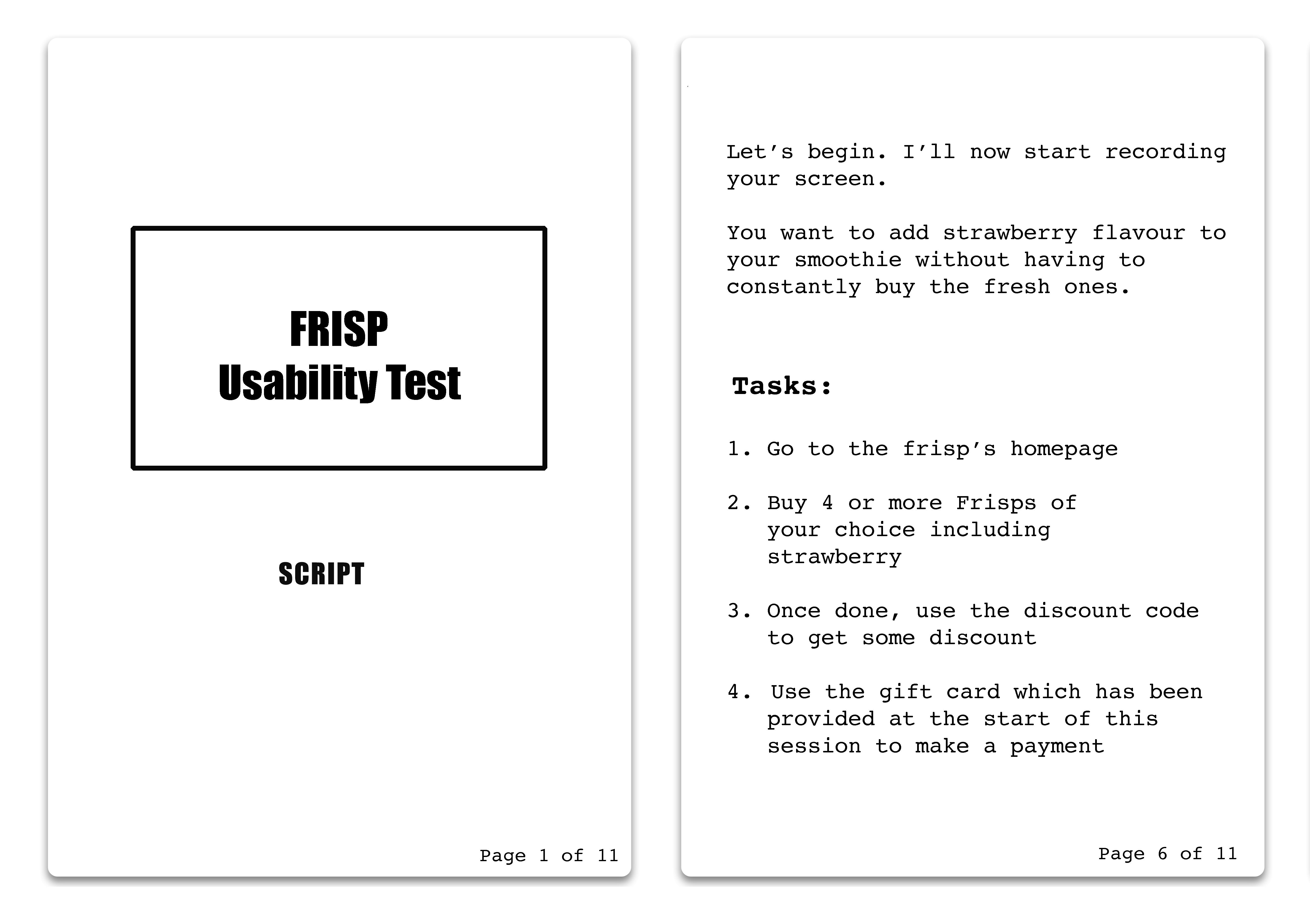
SCRIPT for usability test session
We took notes of the areas/ tasks where users were struggling and seem confused, unsure of what they were doing. The short interview session at the end of the session helped us more on figuring out what needed to be changed.
Key findings & changes
1. Sticky Header
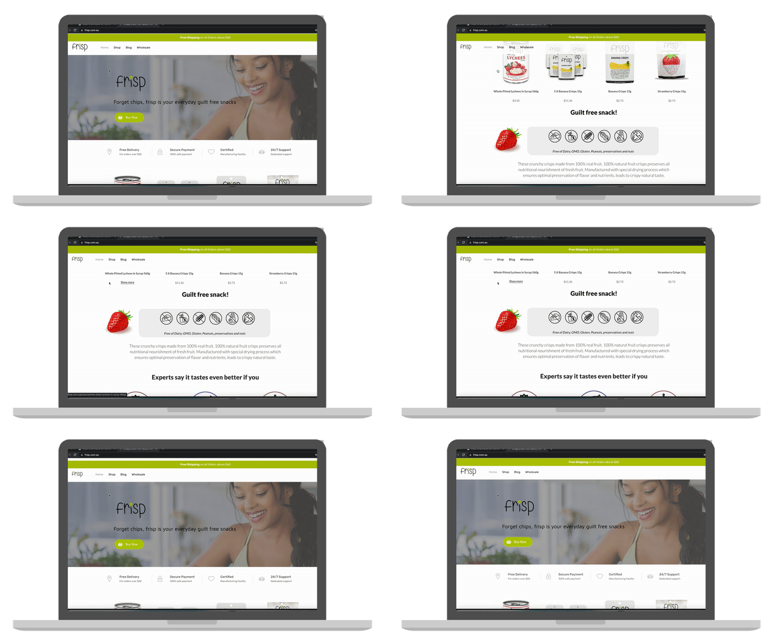
Despite having buy now button everywhere, users were often found scrolling to the top of the page in order to use the menu. Hence, we decided to change the fixed header to sticky.
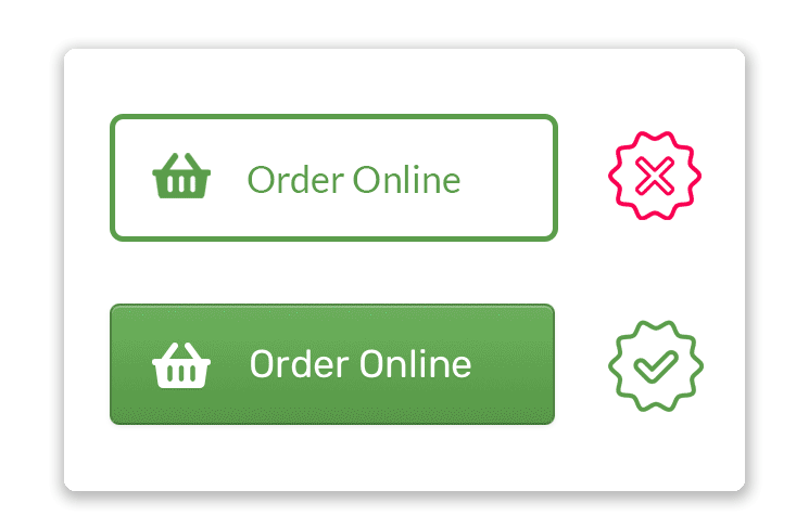
2. Wired buttons
Users were found disregarding the button right in front of their eyes and were often using banner to access the shopping page. Upon further discussion we came to a realization, that they didn't registered the existing button as "a button" because it didn't looked clickable.
2. Minor design changes
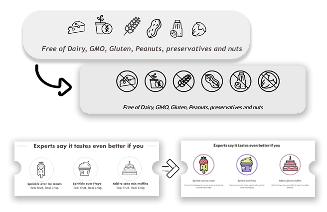
It looks like the infographics is saying it contains nuts, dairy and everything else, shouldn't they be striked out? - TJ
How would it look if the design icons, which are plain black & white were colourful - Nick
FINAL DESIGN
After several iteration and design validation later, we decided to replace the existing frisp website with a new one. The implementation was done using WordPress . The decision to use WordPress was made because, the existing Frisp's website was built using WordPress and it was the platform familiar to everyone working at Frisp. There were few hiccups during the launch, but everything was fixed and the Frisp website is now up and running.
The current frisp implementation can be viewed at: frisp.com.au
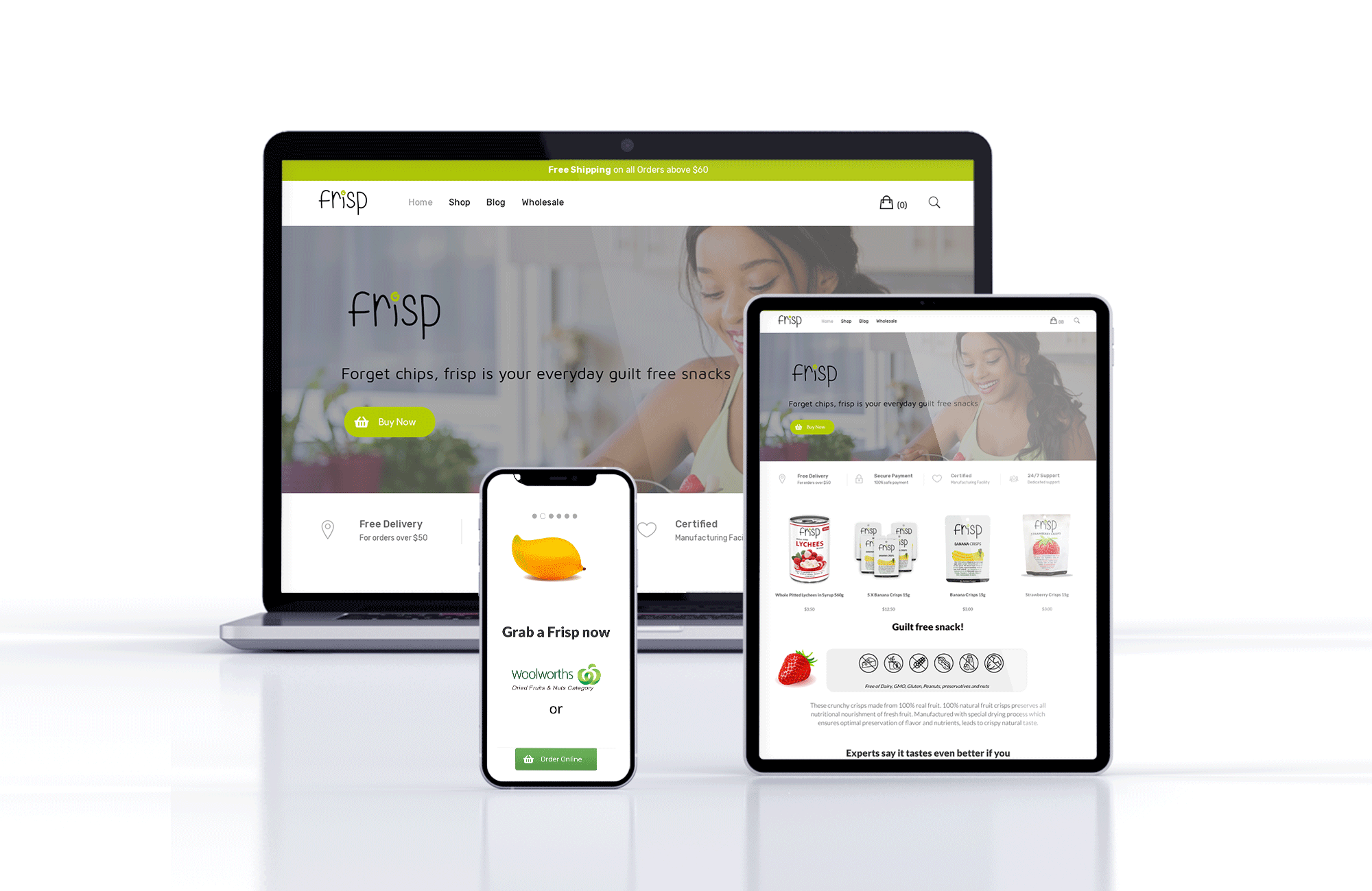
Final Design of frisp
Results
According to the frisp team, the rebranding has yielded a very positive result and increased sales of frisp. They have decided to add more Frisp products to their existing product space and they are positive that it'll be a success.
It has been reported that the customer bounce rate has decreased drastically. We are yet to find the exact numbers on these reports. Overall, Frisp seems to be doing great with rebranding project.

 Sold in major Australian Supermarkets including Coles and Woolies
You must be logged in to post a comment.